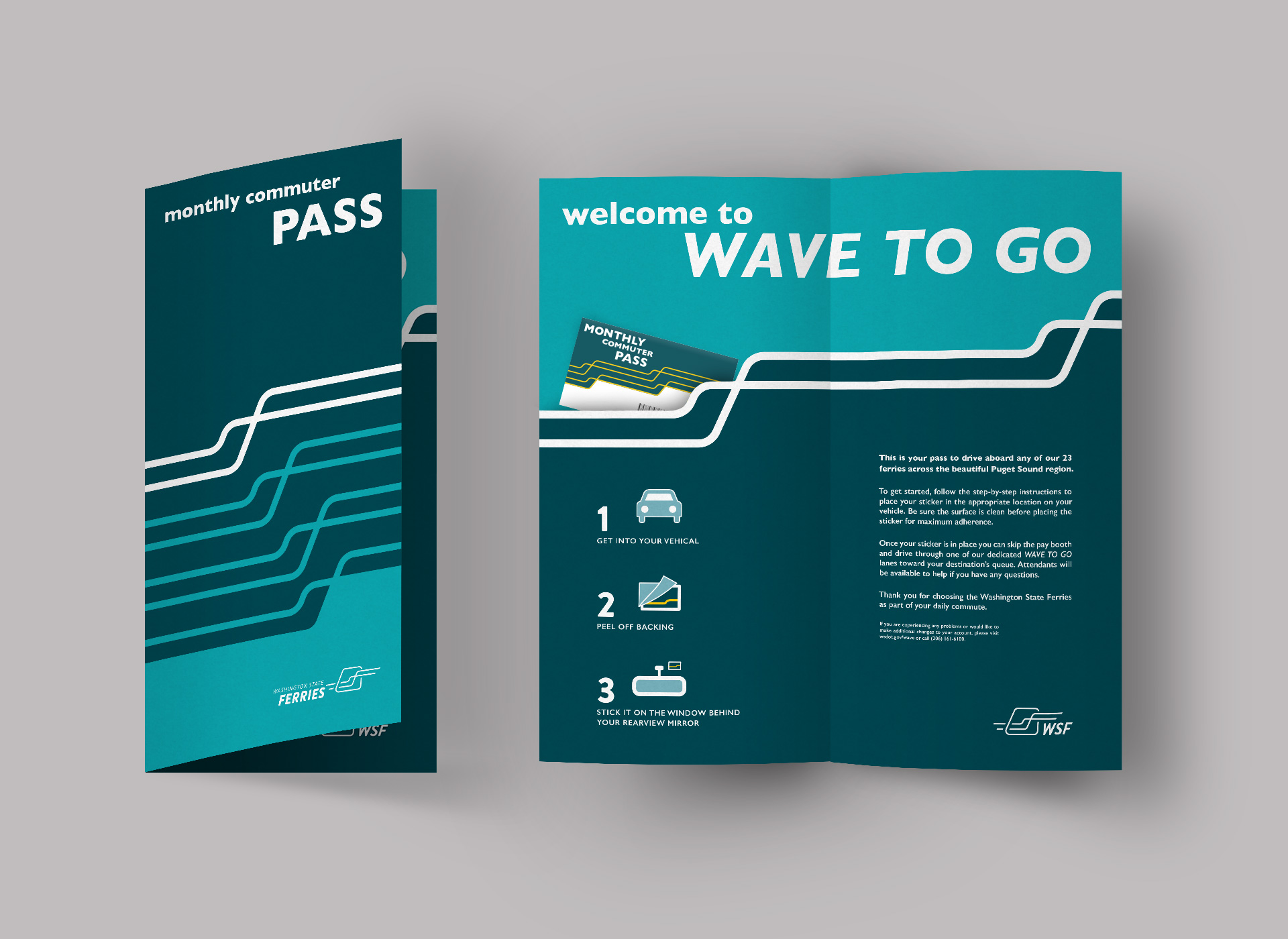
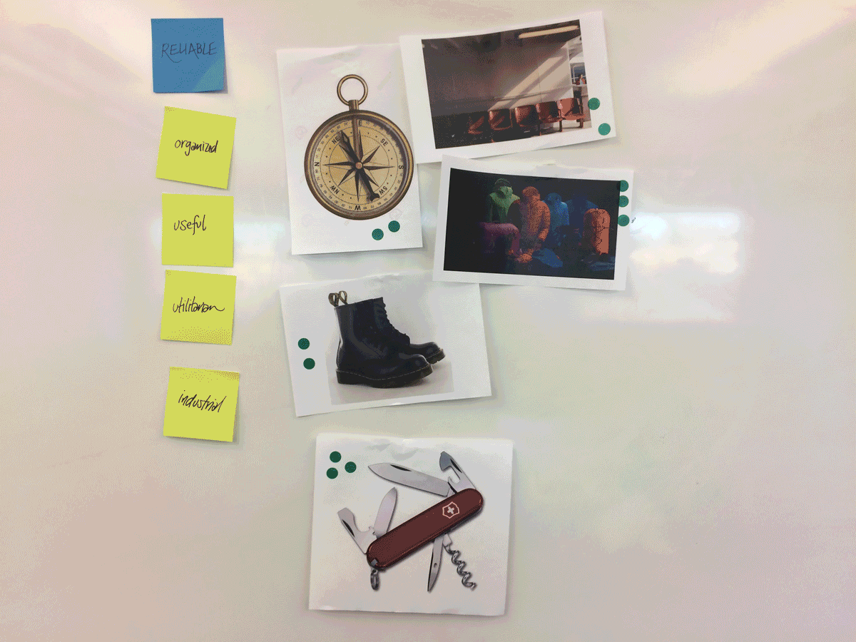
Processing through what WSF is and is not was an important step. The ferries aren’t just any pair of work boots, they are your long lasting reliable work boots.
Washington State Ferries
Branding | Identity | Visual Design
Concept for a State Department Rebrand.
Duration
10 weeks
Roles
Branding | Logo Creation | Layout
Tools
Illustrator | InDesign | Photoshop
Collaborators
Nick King
Washington State Ferries is currently the only choice for most commuters crossing the Puget Sound. Due to a surge in moving to the city, and those telecommuting from the comfort of their homes, the ferries have seen a decline in ridership. With new, quicker transportation options being established, Washington State Ferries needs to stand out as the trusted, reliable mode of transportation it is.
 Establishing the Brand
We started our process with a deep dive into Washington State Ferries. Luckily, because WSF is government run, their rider data is all public. After an intense research phase, we discovered the Ferries are sustained by commuters. Realistically, they need a brand that speaks to their commuters more than to tourists.
 Building the Identity
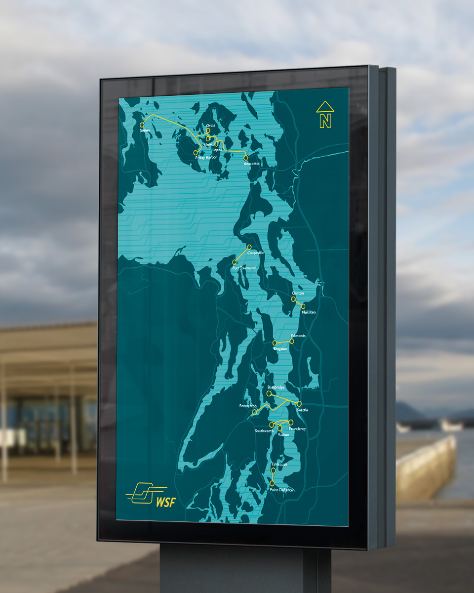
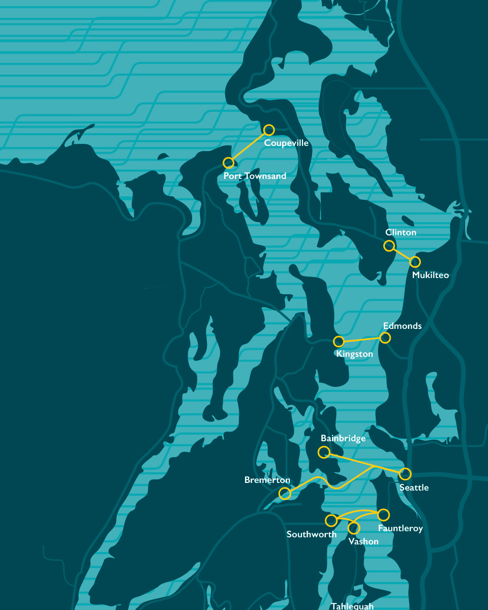
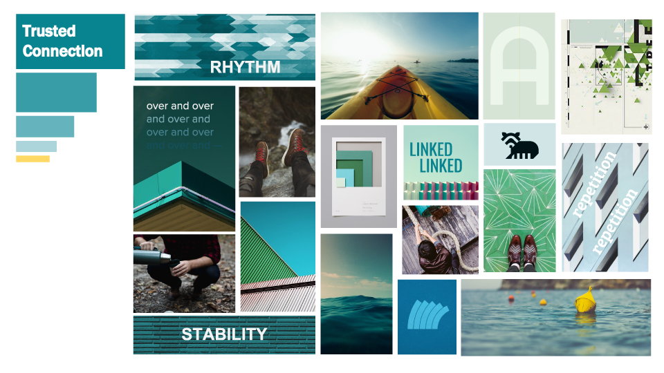
We studied the shapes of the iconic ships and discovered the ferries curvature and repetition. The logo is built on the idea of the experience you have traveling on the Ferry. Besides being reliable, the ferries really are the most relaxing part of anyone’s commute. Riders get out of their cars, and take a break while sipping a local beer or playing cards, but most importantly they stare out the window at the beauty of the northwest. The window becomes an emotional connector for the rider and the relaxing commute.
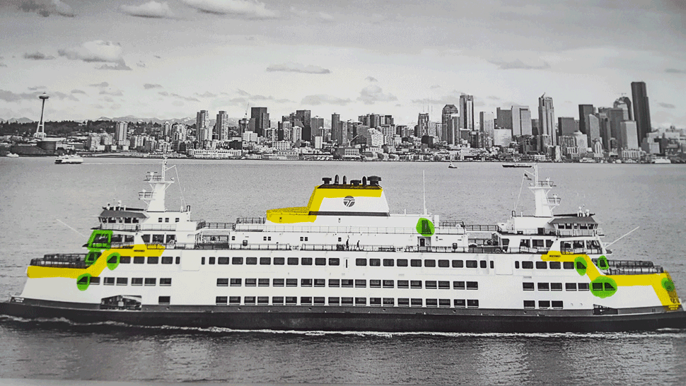
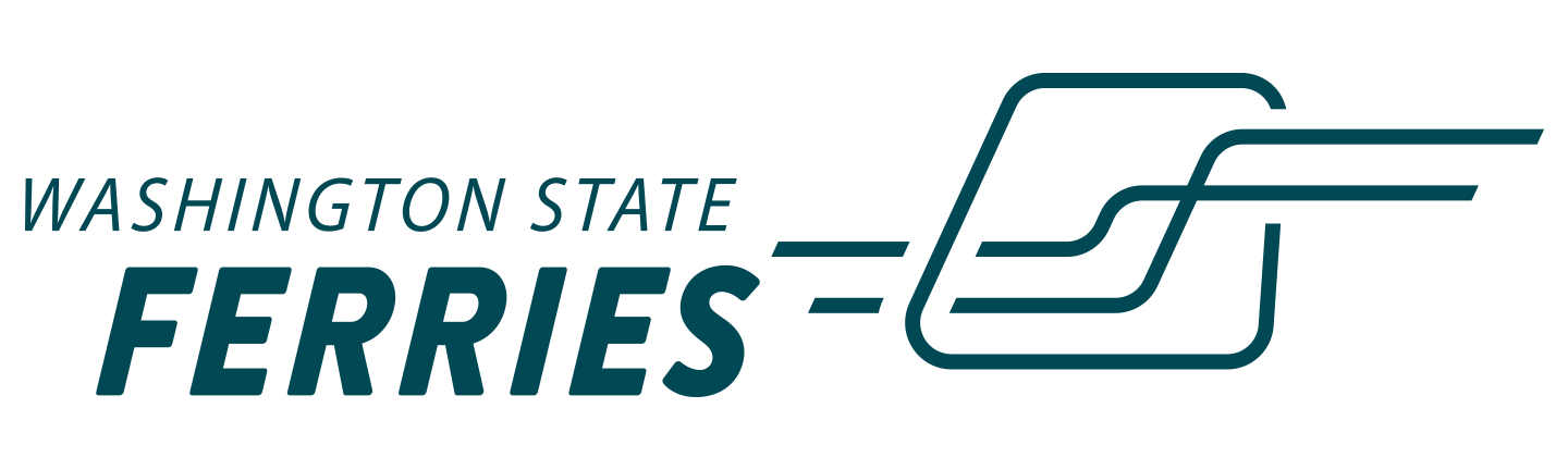
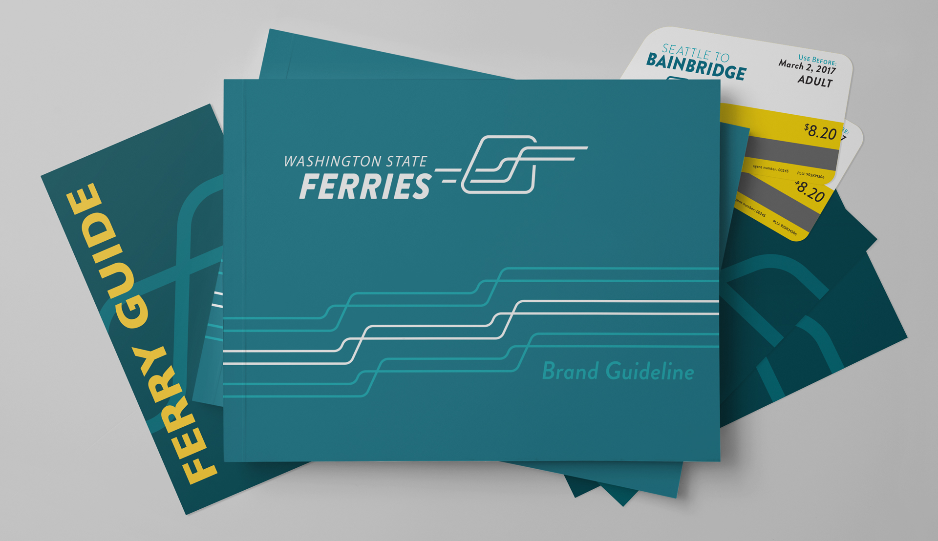
Created out of two elements, the Washington State Ferries brandmark is simple enough for a child to recreate from memory while still unique enough to be immediately identifiable. The elements used are directly inspired by the ferry’s physical structure but also hint at many of the character traits held by the Washington State Ferries.
The primary element is the window. A recognisable shape, this form can be found aboard the Washington State Ferries vessel fleet. With its asymmetric forward lean and friendly rounded corners, this element perfectly captures the visual tone and structure of the Washington State Ferries.
The secondary element is the intersecting lines that travel through the window. These lines were derived from several sources of inspiration: the silhouette of the ferry’s profile geometry as well as the picturesque and unique landscape of the Puget Sound region. The lines symbolize connections made across the water and forward movement from one physical location to another. The lines create a visual relationship between that which is outside and that which is inside.
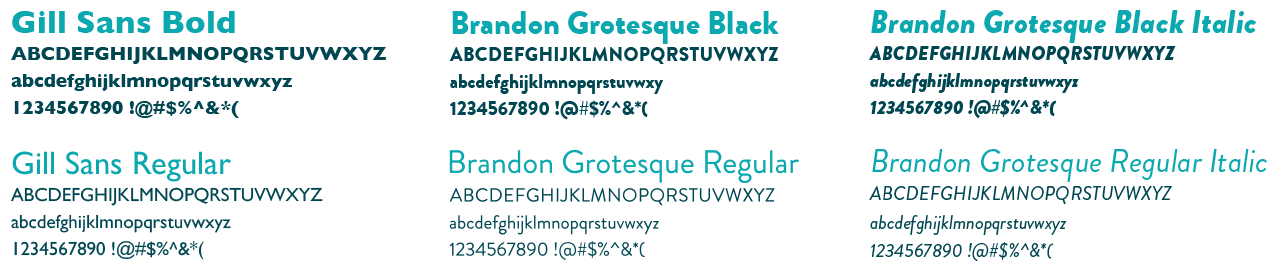
Type is an important part of the cohesiveness of the Washington State Ferries brand identity. The use of two typefaces allows for breadth and diversity while remaining steadfast within identity guidelines.
Brandon Grotesque, which is used in the logotype, should be used only in instances of ticketing and advertising. This outward facing typeface will create a visual connection across platforms.
Gill Sans should be used in all other instances from way-finding to internal body copy. This typeface shares a similar visual form to Brandon Grotesque while stabilizing its playful energy.