Graphic Design

Wild State Cider

Branding | Identity | Packaging | Visual Design

Launching a Cider Brand in Duluth Minnesota

Duration 4 months
Roles Branding | Logo Design | Packaging
Tools Illustrator | 2019 FDA regulations
Collaborators Nick King

Started by a group of friends who met at summer camp, they thrive on bringing people together, celebrating the outdoors and protecting what’s wild. They came to Nick and I with a huge amount of passion and a lot of planning already done. We were thrilled to take this on and help Wild State launch with a cohesive brand. Hint: it was super successful, and they are thriving!

Tonal Territories

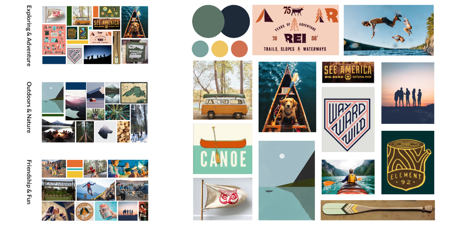
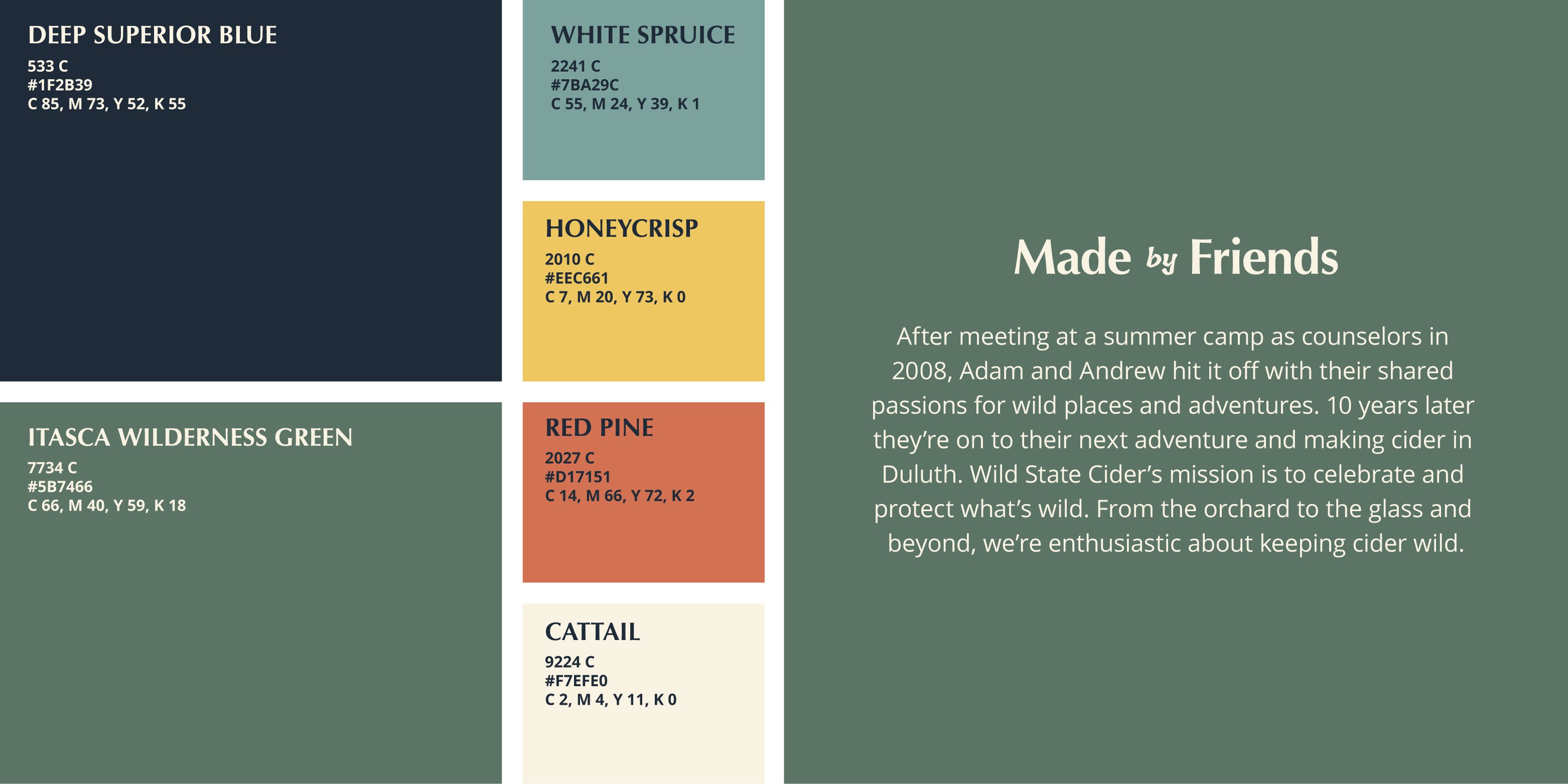
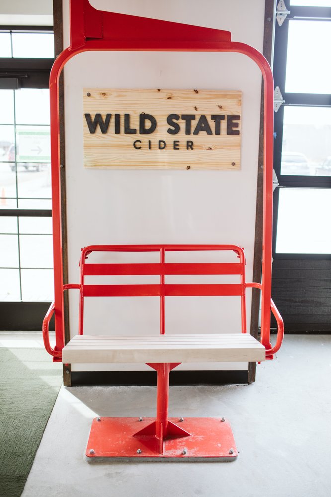
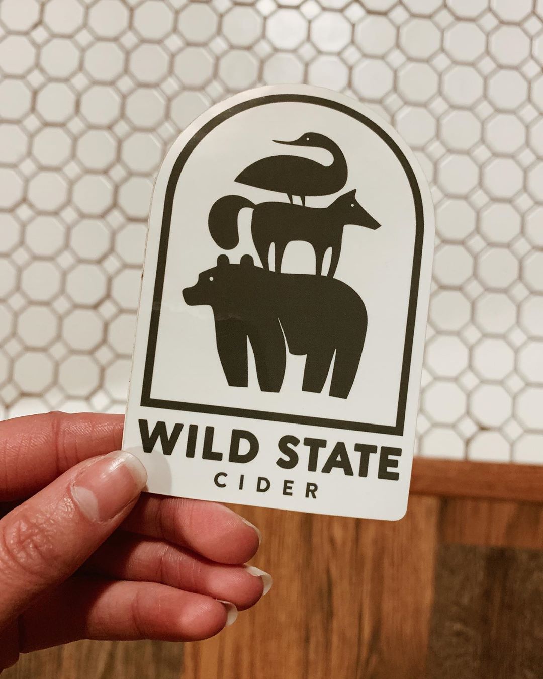
Sometimes a discovery phase is about research, and sometimes it’s about getting on the same page. We were very excited to see the amount of research and planning that Wild State had already done when they came to us. So this phase really was about defining what they were showing us, and taking a deeper to dive into what the brand could become.

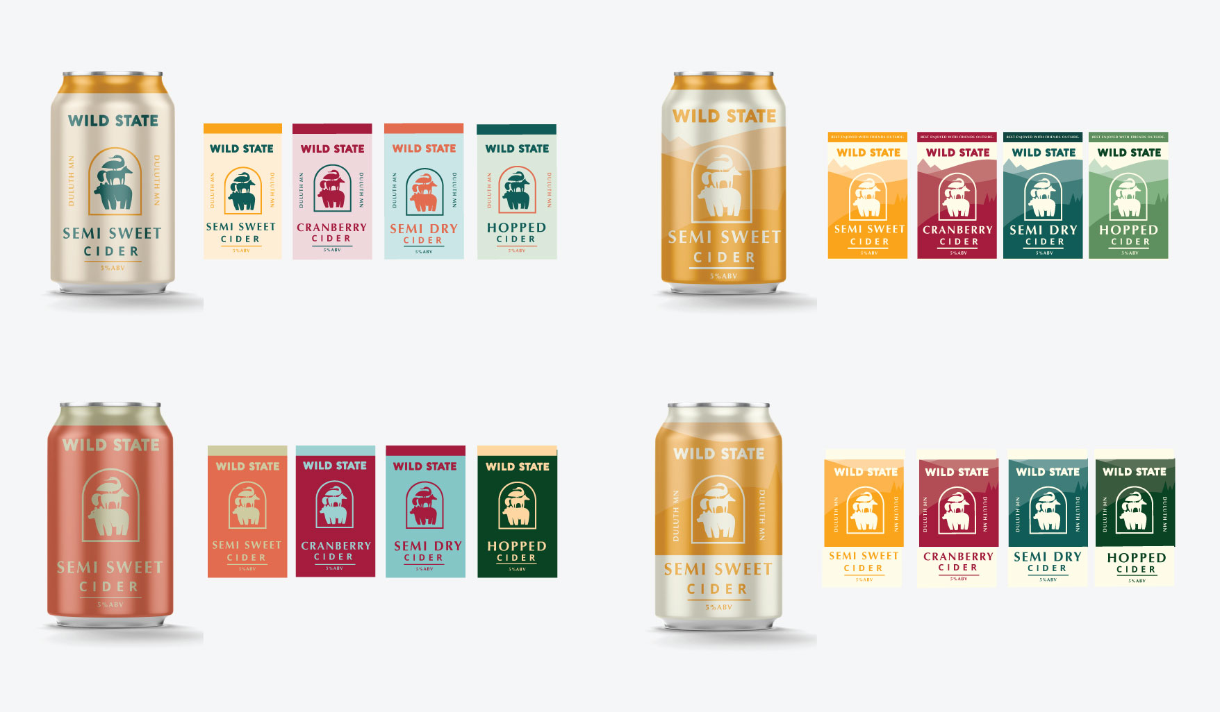
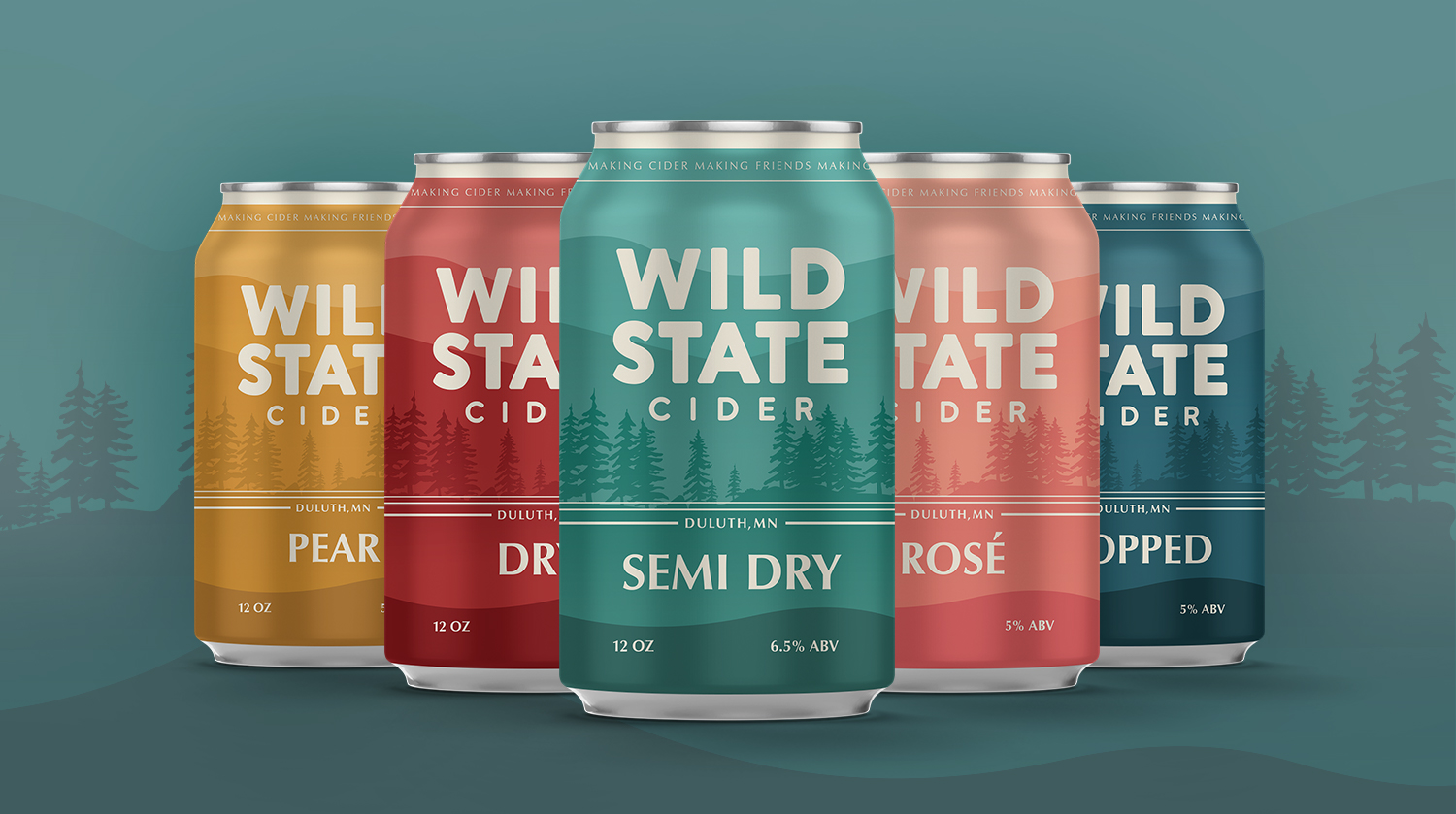
 We developed a response round to their research, and from there created three tonal territories:

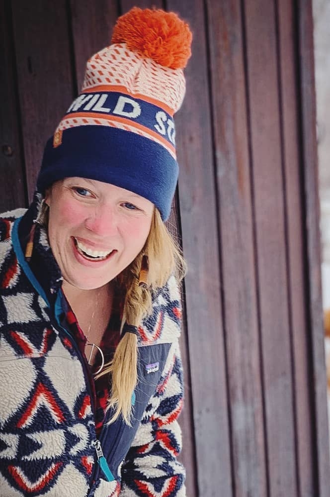
  1. The action and exhilaration of Exploring & Adventure
  2. The space of the Outdoors & Nature
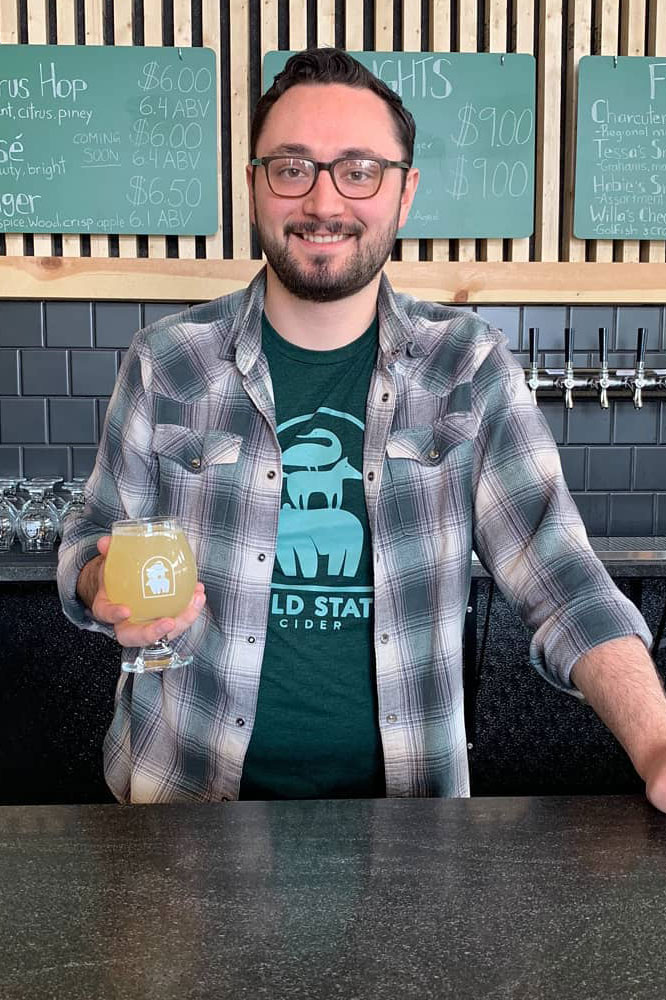
  3. The welcoming vibe of Friendship & Fun.

We then combined these into a single board that would guide all visual decisions moving forward.

Logo Development

Wild State was very open regarding the logo process. They didn’t know what they wanted going in, so we started wide. Showing plenty of pencil sketches, we had them mark with a simple yes or no, and then discussed their favorites and least favorites, really pulling out what spoke to them and why.

We grouped what they liked from round one, created a few options from there, and then narrowed down to a final few that were presented along mockups to really get a sense of where the logo could go.

The chosen logo of stacked animals represents the brand pillars of coming together, having fun and keeping it wild. The archway, taken straight from the architecture of the building Wild State would call home, lets everyone know they are welcome. With a bit of refinement on the illustration and some custom type (derived from Avenir, Brandon Grotesque and Proxima Nova) this logo really brought everything together for the Wild State family.

Color and Type

For Wild State, color would be used both to delineate flavors and to highlight the brand pillars. it would be used within the space, on clothing and on the all-important cans. We started with the anchor colors, a deep blue and a natural green, and supported them with some lighter and brighter accent tones.

Typography was a great way to bring some extra energy into the brand. We chose a humanist sans typeface for headlines and titles. While being clean and legible, it’s got just a little extra friendliness, almost like the fun camp counselor of typefaces. Tillana was given as an extra accent font, you’ll see it here as “by” in the title lock up. Then open sans is used for all body copy, keeping it clean and legible.

Can Design Process

I was fresh off of designing a bundle of new labels with the new FDA guidelines when this project started, so taking on the can design was really exciting! This was hands down the most important thing for Wild State. With the knowledge that this was going to be most people’s first interaction with the brand, it was important to launch with a strong and clear design. This was one of those rounds that we knew had to be handled with care, and we made sure the Wild State team was along for the ride. We started with some shelf research, and then dove into multiple rounds of design; all focused on the front cover of the can.

With the front decided on, next we moved onto the most intimate parts of the can. The parts that would really connect people once they picked it up, the parts that would build brand loyalty… or even brand friendships. The slogan we had worked on with the team “Making Cider, Making Friends” was discovered to work no matter where you start reading; as they really are friends making cider, who are making friends along the way. And that circle really drives that brand pillar of bringing people together.

Letting the Brand Fly

Once the can was done, we moved onto a few other touchpoints before setting Wild State off to flourish. We started with some merchandise, but would work with local artists to create more. We set them up with their classic cans to start, and a template that would get passed around to other designers for fresh iterations each season. Sometimes the most important part of launching a brand is letting it fly out of the nest and mold to what its customers need, and we are very proud of where Wild State has flown.