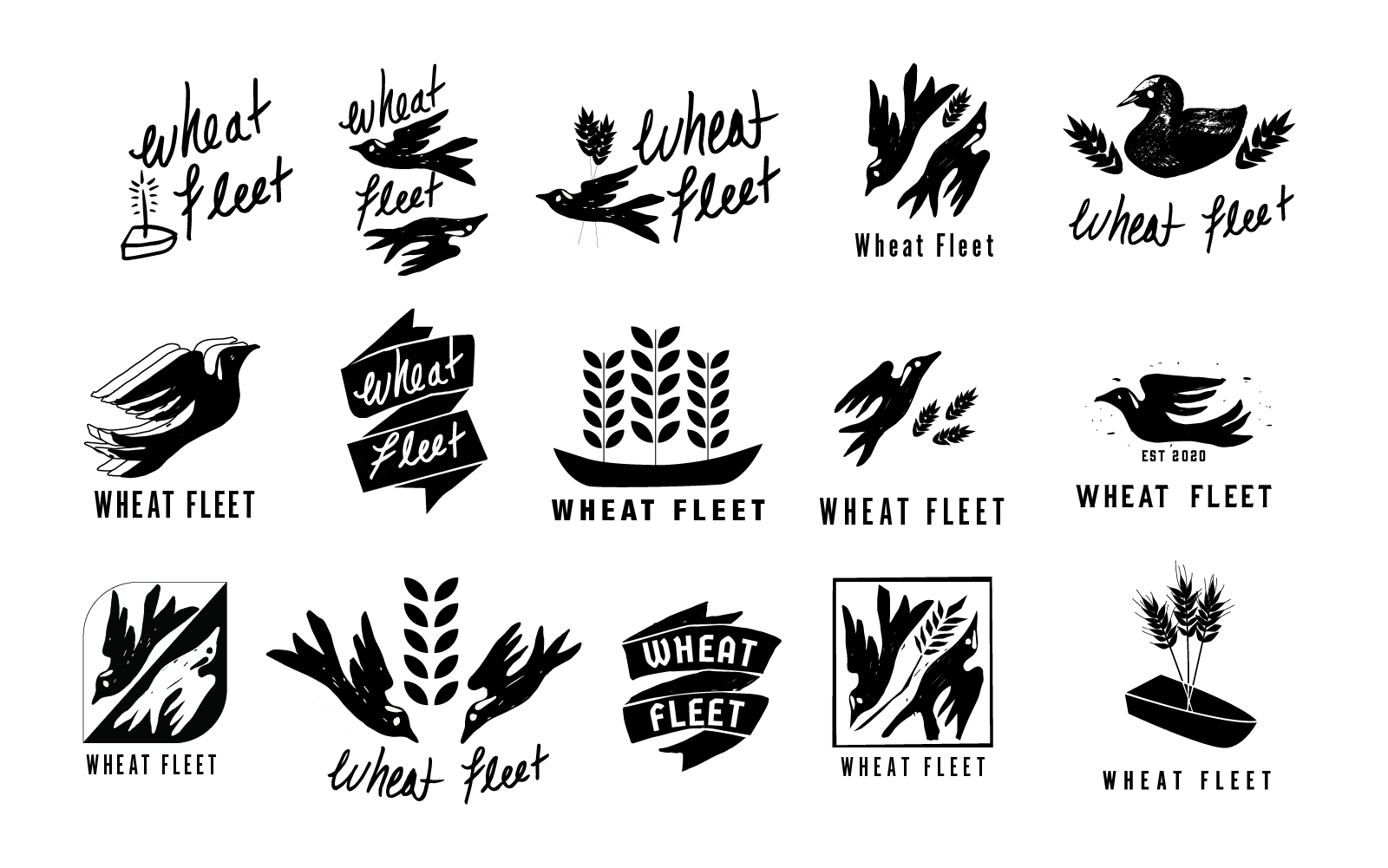
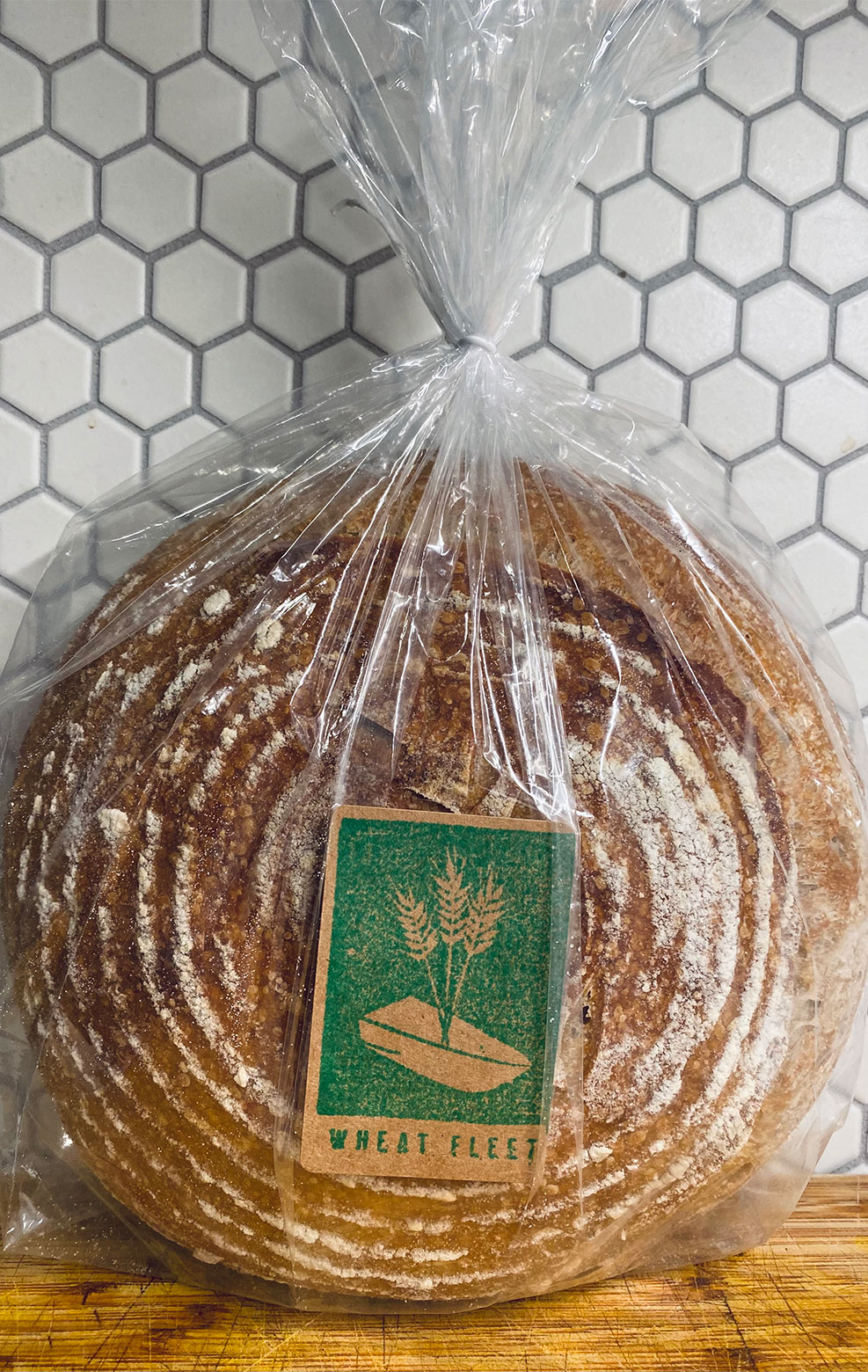
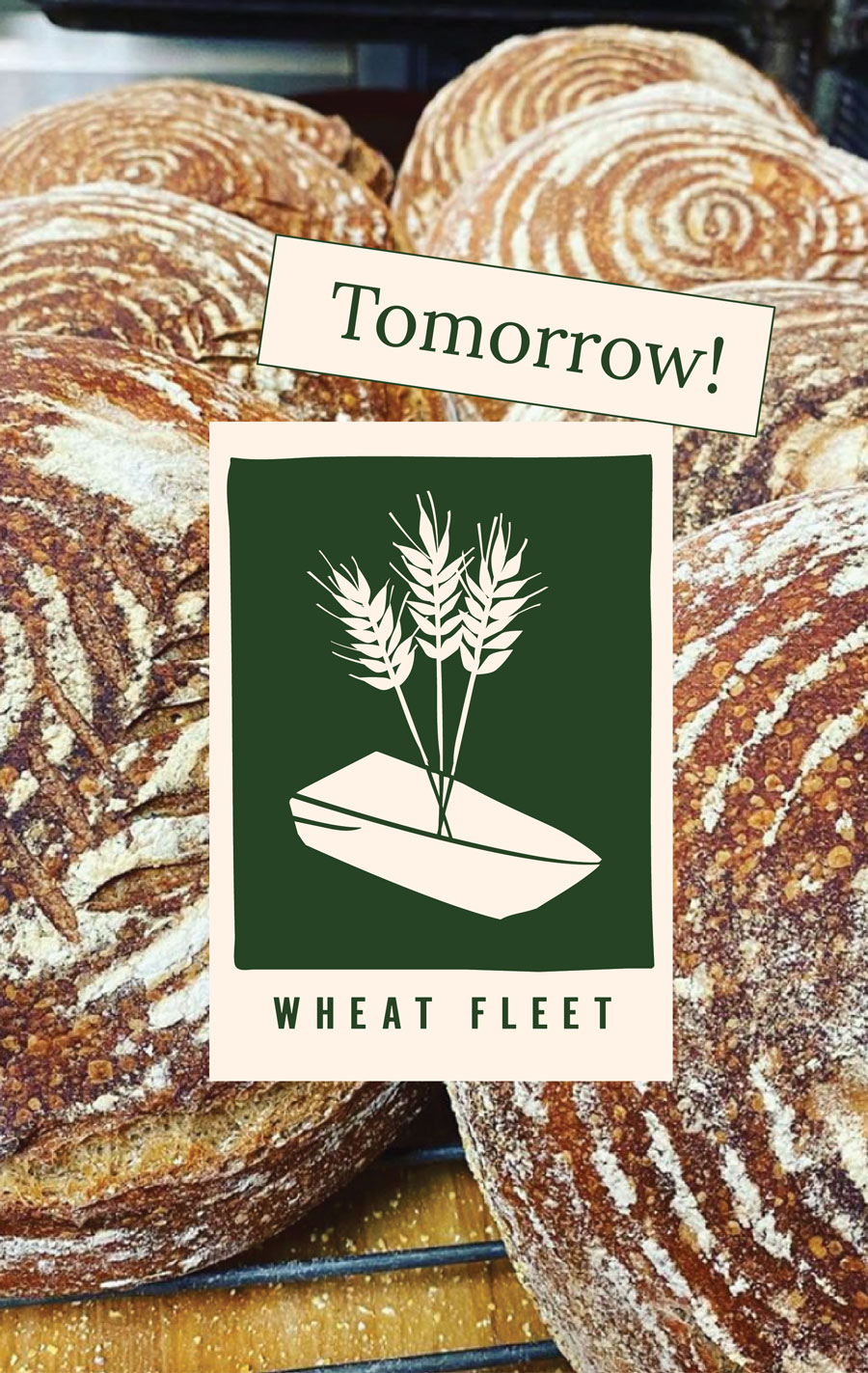
For Wheat Fleet we wanted something that felt organic and honest, something that spoke to the grain and the nature of making bread. For the pared-down scope we did a few smaller rounds. We focused on sketching and narrowed down along the way. We had decided fairly early on that representing the brand with a boat told the best story, as this really was a traveling fleet of bakers, but we also wanted to explore the option of using a mud hen: a local bird that when in a group is called a fleet.
Wheat Fleet
Branding | Identity | Visual Design
Launching a Pop-Up Bakery with a Pared-Down Scope
Duration
3 weeks
Roles
Branding
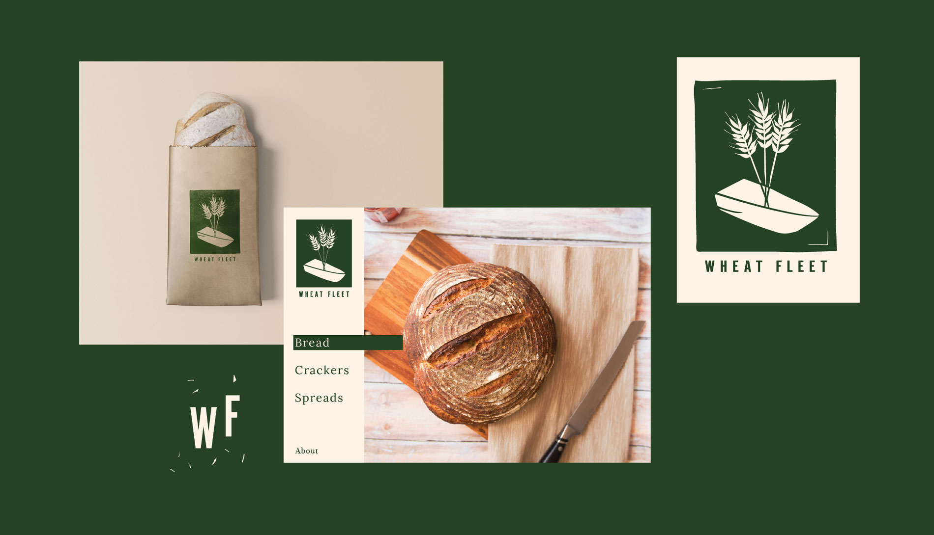
New companies often don’t have the time or budget to do a full build, so I did a modified scope to launch this one. Wheat Fleet’s offerings of fresh sourdough products were born during the pandemic. A simple weekly offering, baked inside of a Danish pastry shop; this brand needed to feel small and local, fit into the atmosphere, and still have potential to grow.
Logo Development
 Presenting the Full Story
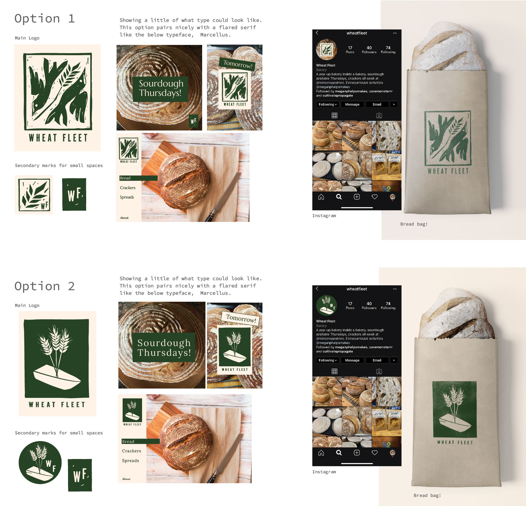 Setting Sail
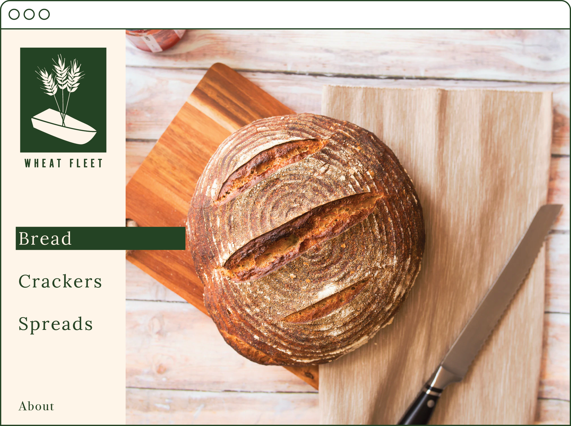
Instead of defining the look at the beginning, we let the logo rounds be our guiding path. With final options presented alongside typography, color, photography and layout a full sense of where this logo could take the brand arose.
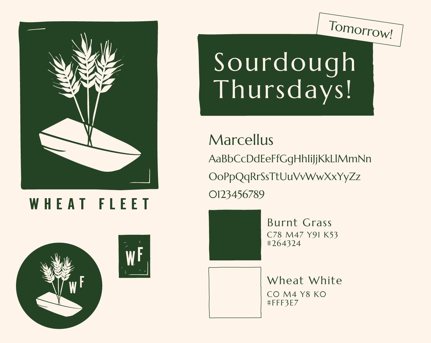
To help Wheat Fleet launch, I left them with a simple set of responsive marks, as well as suggested color and typography use. For a small launch, you often don’t need the whole suite, and I am happy to do a paired down scope to help a small business get off to a good start.