Graphic Design

Queen Anne Real Estate

Branding | Identity | Visual Design

Bringing New Life to a Neighborhood Institute

Duration 3 months
Roles Branding | Logo Design
Collaborators Alfred Astort

Queen Anne Real Estate has been the crown jewel of real estate in Queen Anne for over a decade. As they’ve grown and reached new neighborhoods in Seattle, they had found themselves competing against the larger agencies, so they decided it was time for a brand refresh.

As a small, collaborative team, they came to me wanting to highlight what makes them different.

Discovery

Diving into what makes Queen Anne Real Estate special wasn’t too difficult. Unlike most real estate companies, who set their agents up for competition, QARE works as a team. When you work with one agent, you get a whole crew, each with expertise in a specific neighborhood of Seattle. The authentic experience the agency offers is both intimate and vast. They will help you find your house, but also a neighborhood that feels like home. They have a reputation city wide for cooperative and supportive team members, as their internal team structure really is one of collaboration. 

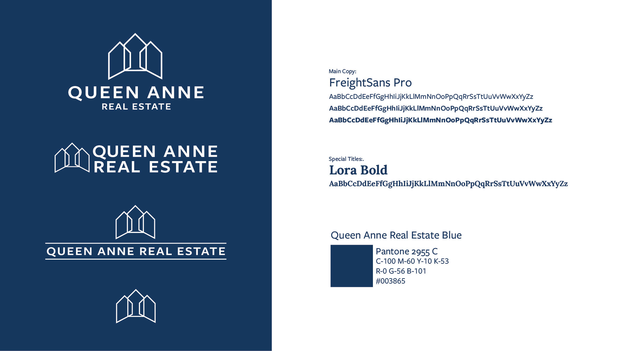
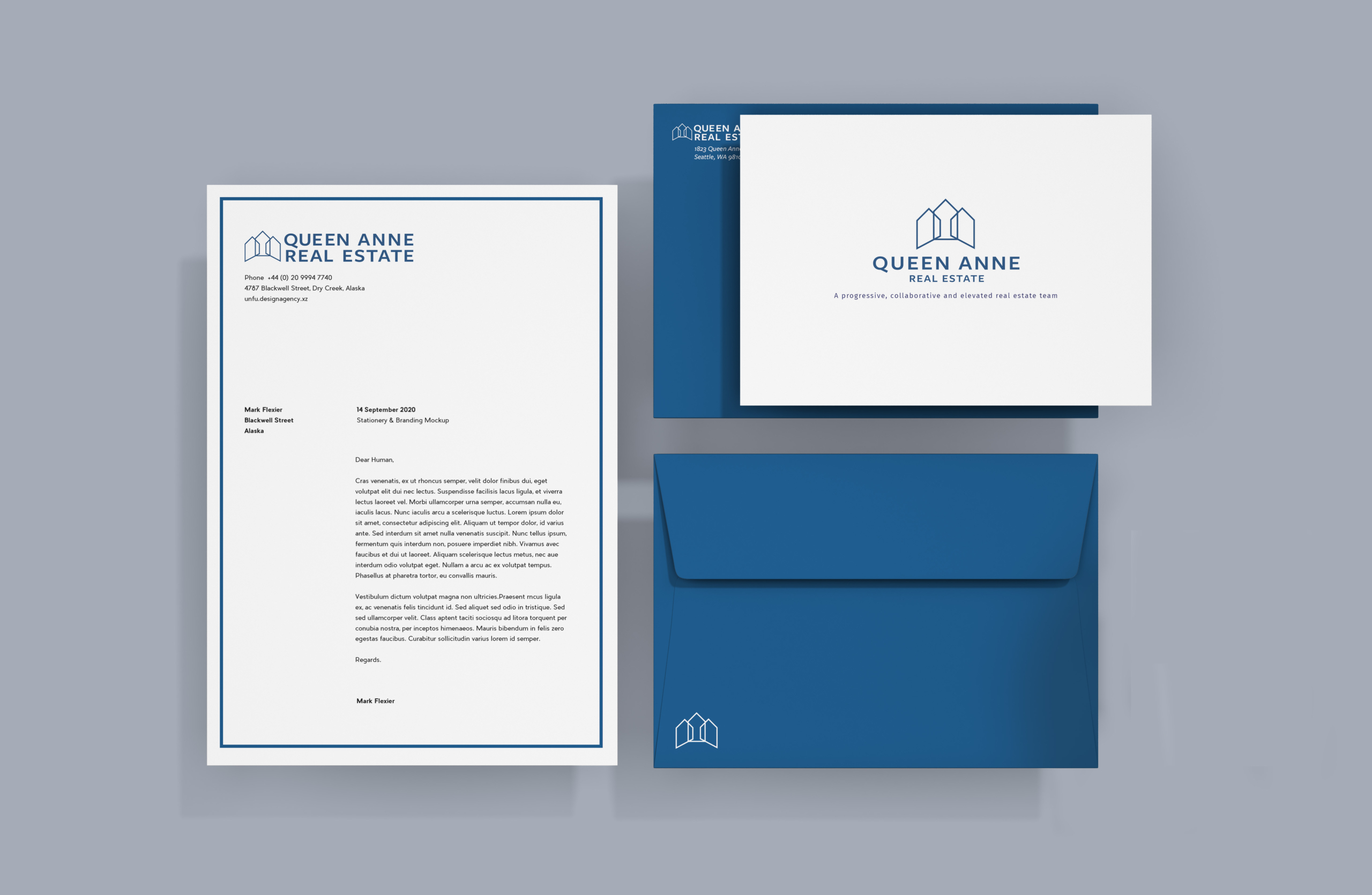
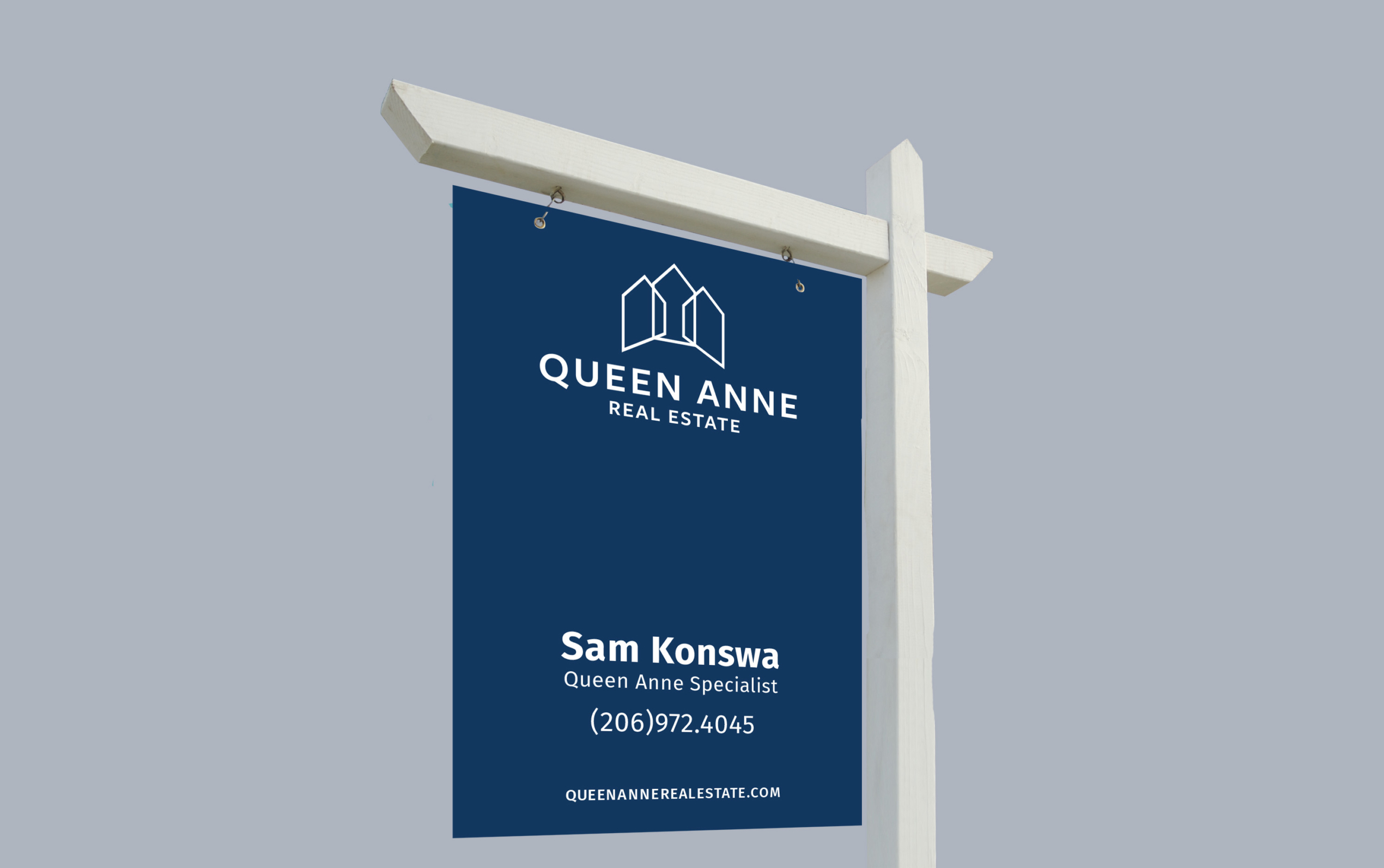
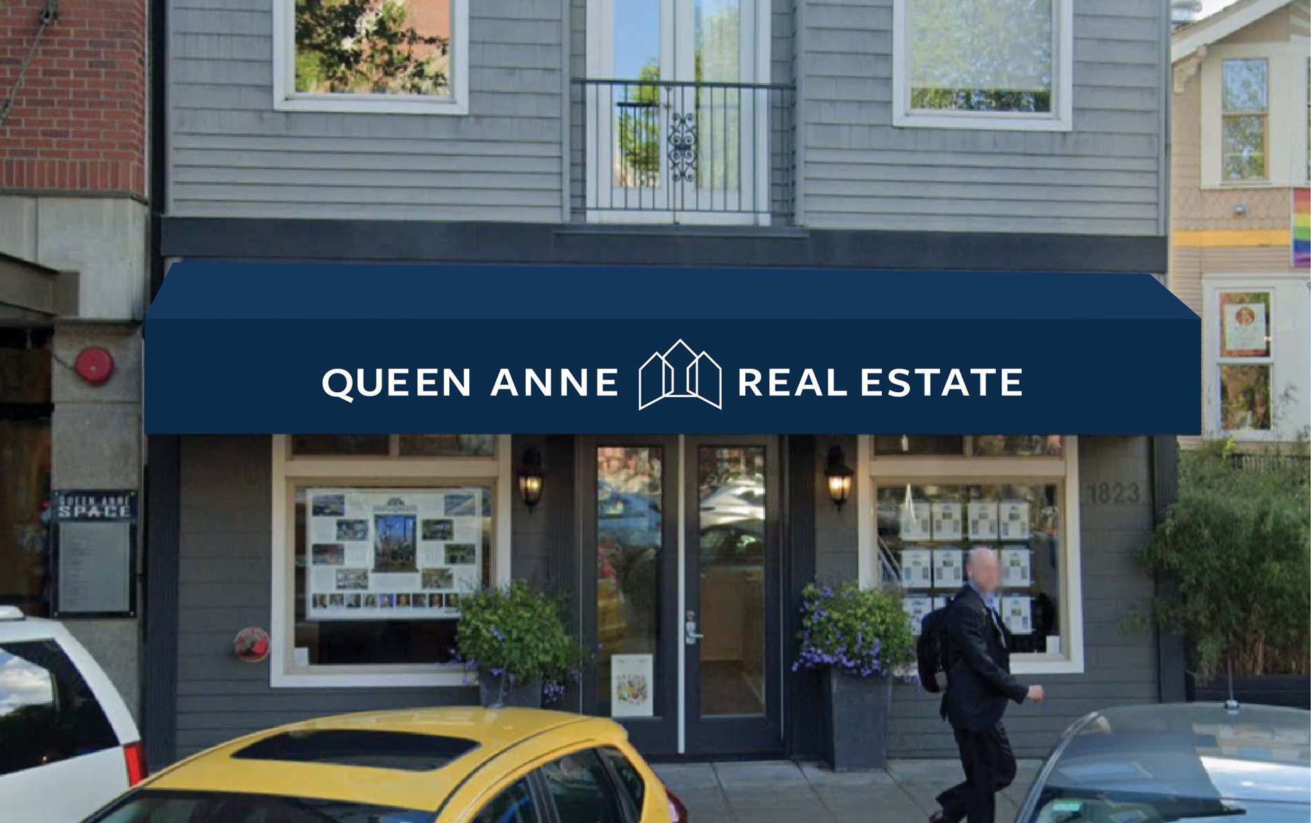
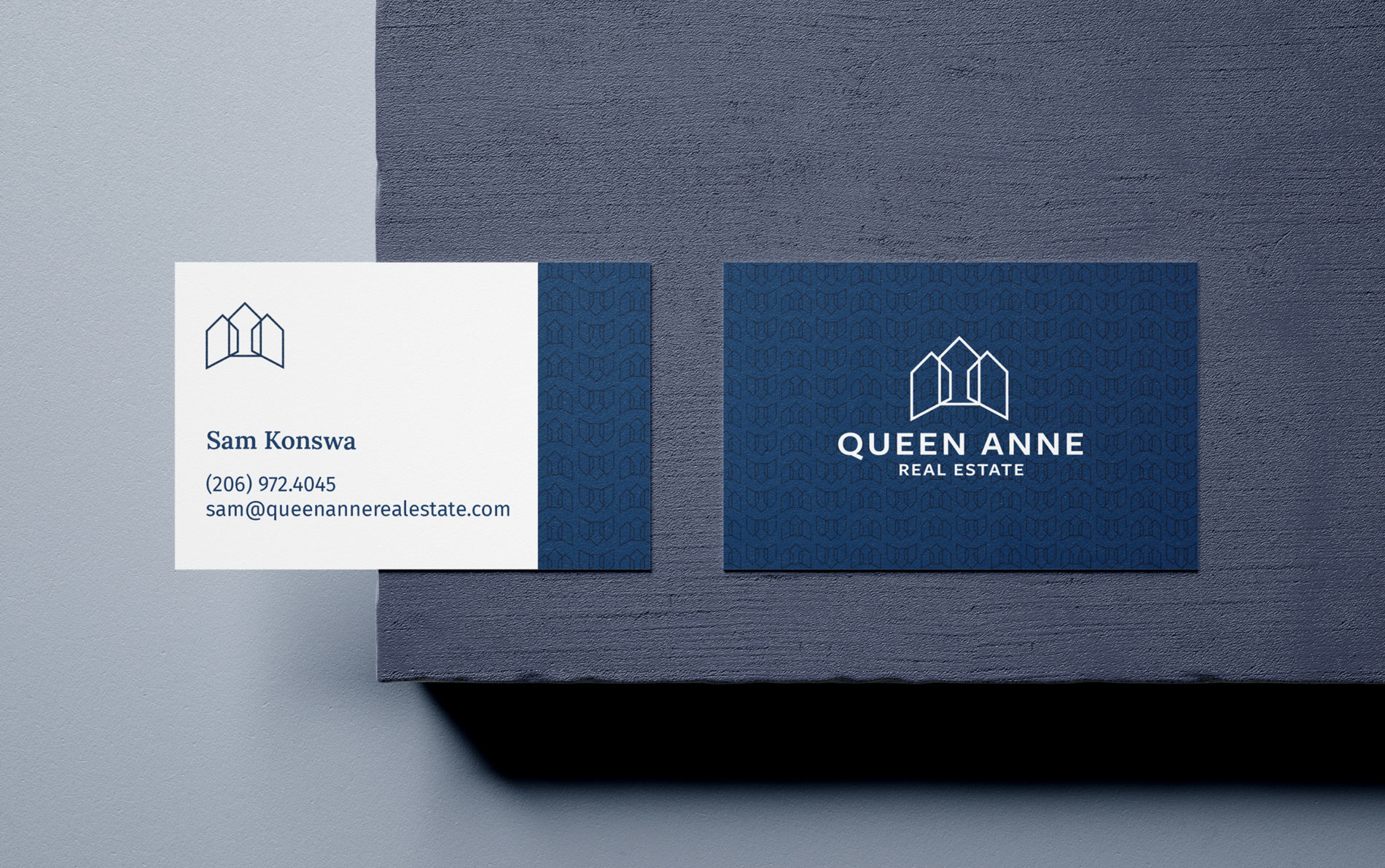
They wanted to come across as larger and more modern to compete with companies like Compass and Windermere, while showcasing their unique qualities.

Look and Feel

In exploring how to connect the brand to its customers, I looked macro, at bird’s-eye views and micro, at textures of paper to ground and highlights of gold to elevate.

Creating The Mark

Changing a mark is a big deal for any company, and at QARE there was a lot of love for the old mark. They had been using it for almost 15 years, and it was a combination of the owner’s favorite homes in the neighborhood. For him, it really represented the brand, but the team agreed it didn’t represent the larger variety of listings they carried, or represent the team as a whole.

After going down a path of creating something new, the owner was missing the old logo. I came to the conclusion that we had to back up and build off of the current one, but do it in a way that was clean, timeless and representative of whole team. 

Earlier we had experimented with using part of the logo, a window or gate, but we all agreed it wasn’t telling the story, and that people were not brand loyal towards the house. Through the iterative logo process I learned a great deal about the team, and with that the solution came pretty quickly. I blurred the old logo and simplified, pulled elements they liked from our previous iterations and came up with the perfect solution.

A crown, built from the silhouette of the old logo, made from a group of houses, represented what really makes this agency unique. The mark showcases the agency’s teamwork, its curated experience, and its legacy.

Building A Cohesive Narrative

Taking what we learned and our new logo we set off to build the final touches of the brand, With patterns made from the logo, a flyover drone video and some special touches we brought the agency to the modern era. I worked with Alfred Astort to make sure the physical and digital experiences matched, and set Queen Anne Real Estate off into one of their busiest seasons yet.