The decision of which industry to highlight in this issue, was one based on current media trends. With the hype of the film Hidden Figures due out around the magazine release date, it was the perfect gateway to finding and highlighting these lesser known stories of the women who brought us to space. Future issues might center around politics, art, science or whatever topic is appropriate for the time.
Matriarch
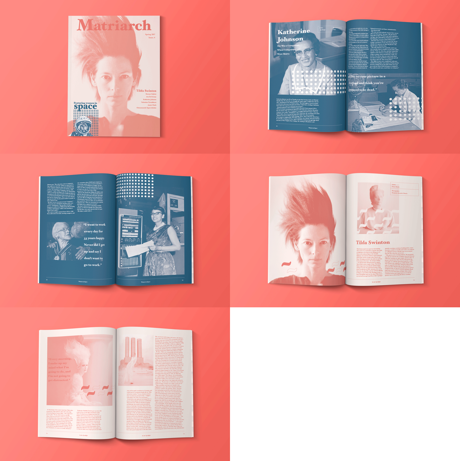
Matriarch is a quarterly magazine focused on bringing the stories of strong women to everyday conversation. We aim to help our readers learn about the women who have fought to get to where they are today, with hope more women feel inspired to follow in their paths.
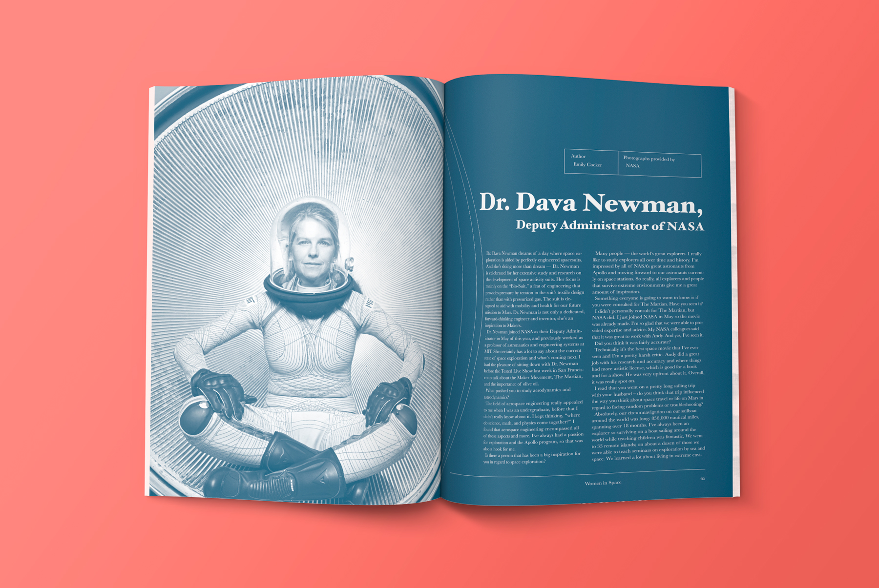
Featuring interviews with modern leaders as well as commemorative sections highlighting the journey women have taken in specific fields. We want to spread the stories of women who are fighting to change their industries, women you know of, who you’d like to know better, and those you wouldn’t hear of otherwise.
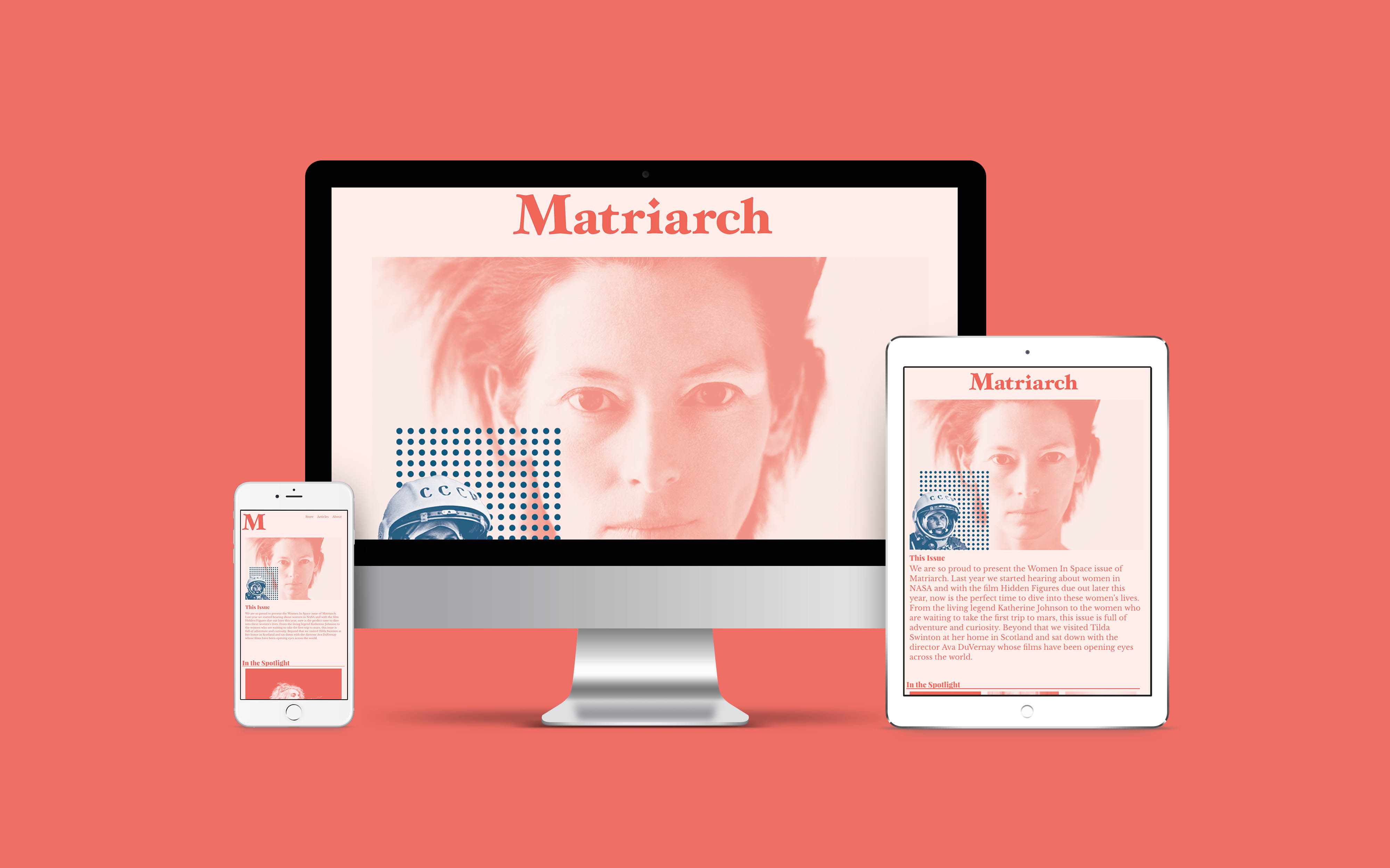
Ultimately, I knew the magazine would have to live online as well as in print. As having a digital subscription is a necessity for most niche magazines.
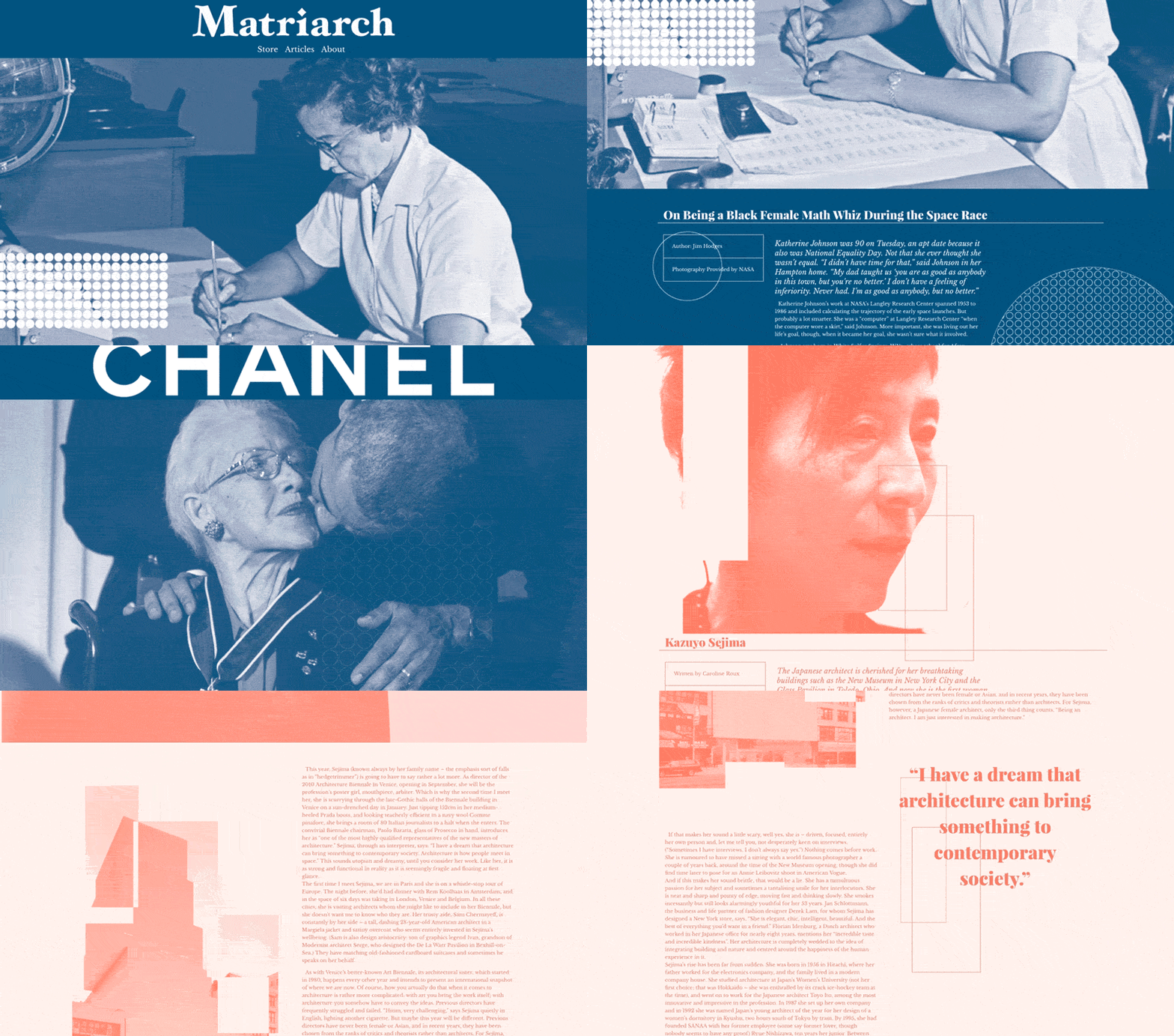
Making sure the experience was adaptable from print to phone, tablet and desktop, and easy for a team to manage, I built out the translation using Bootstrap and WordPress, making custom templates for each color, allowing articles to mimic their printed appearance .
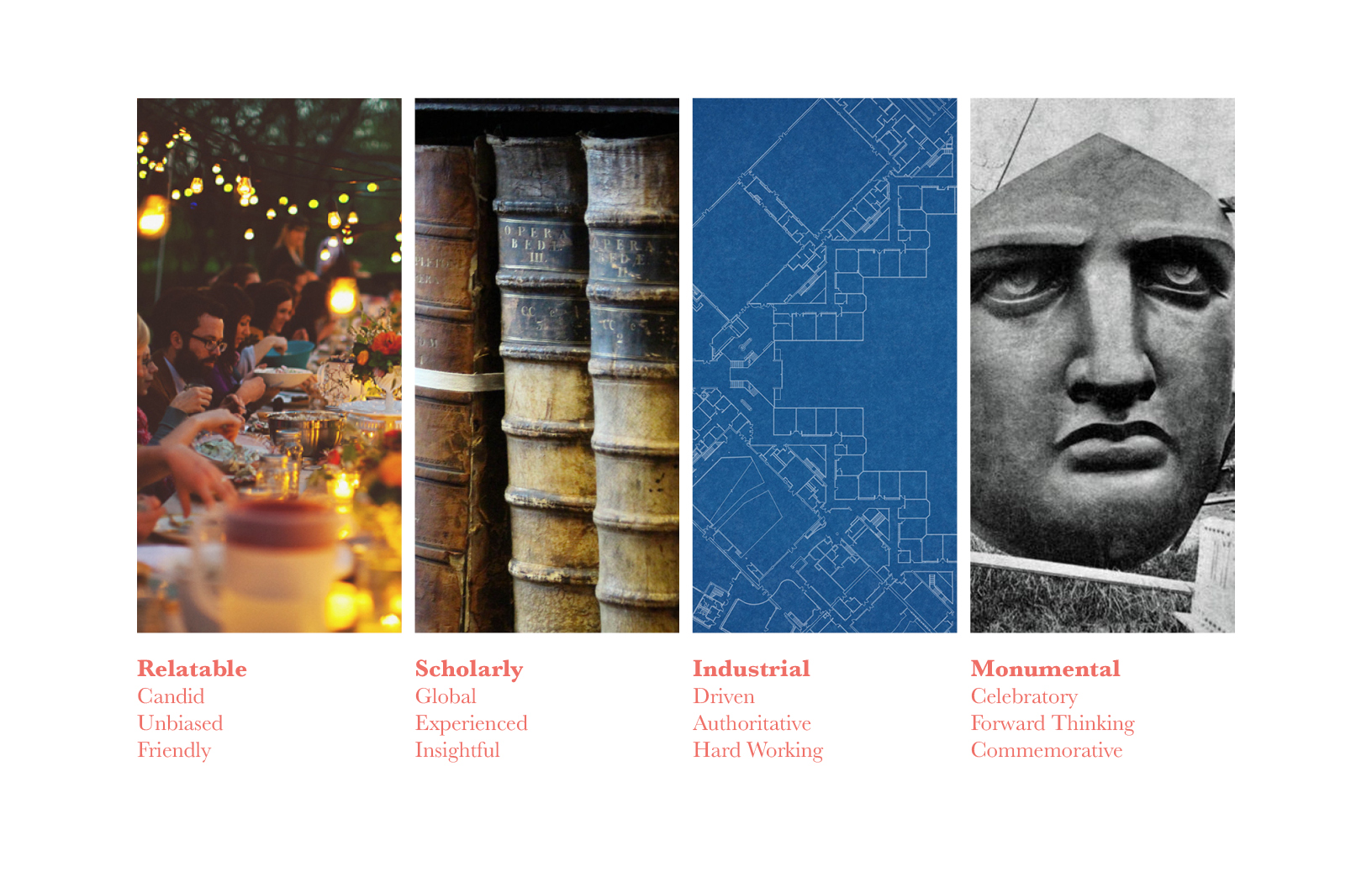
The curation process started with defining the audience. Who would be reading the magazine, how and where they would consume it become a major asset in choosing articles and defining layout.

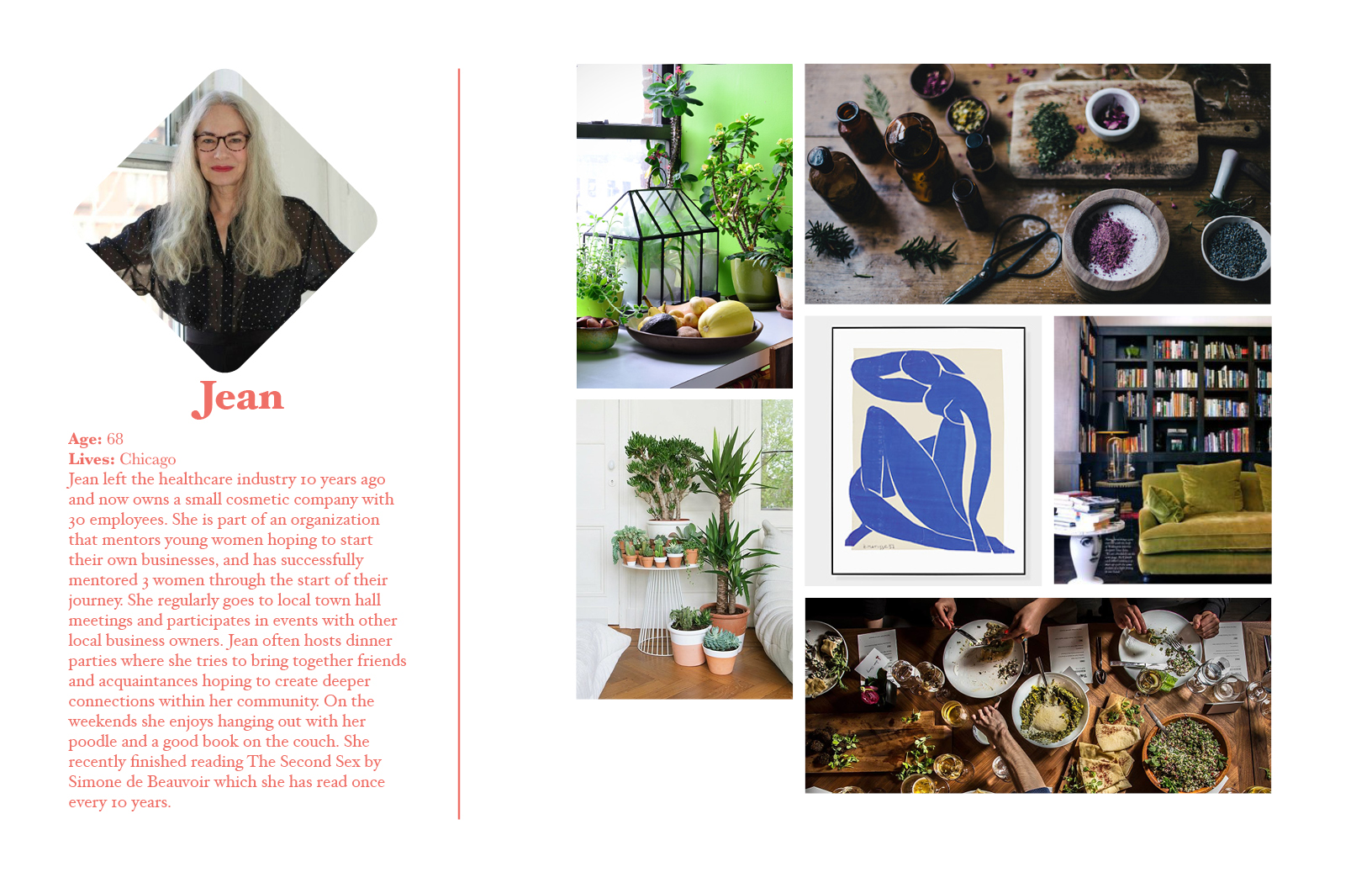
The audience generally drawn to this type of content skews older. So in order to make sure the magazine could reach a wider audience I curated content and design to appeal to 20-70 year olds.
I created reader personas that gave a real sense of the reader's life, why they would read Matriarch, where they might read it and who they would share the stories with.
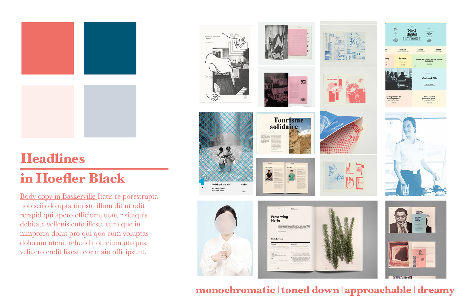
In defining the look of the magazine, I wanted it to stand out in it's genre as well as at a regular magazine stand. By choosing to work with repeating graphics and monochromatic pages I knew it would be something the readers would be proud to leave out on their coffee table.
 Style Guide
 Nameplate

Hoefler Black was chosen as the typeface for the nameplate to give a sense of strength and nod to the old print world, while staying modern. For the nameplate I rounded the serifs, brackets and terminals to give the title a softer, more approachable feeling. Finally replacing the tittle of the i with a rounded diamond, creating a small royal mark for the magazine.