Graphic Design

House of Sorcery

Branding | Identity | Visual Design

Launching a Shape-Shifting Design Studio

Duration 3 months
Roles Graphic Design | Brand Design | Logo Design | Web Design
Collaborators Electric Coffin

After Electric Coffin, an artist collaboration of Duffy De Armas and Stefan Hofmann, began taking on more branded and design work, they hired me to help on the design side.

At about the year mark we had grown exponentially and it was time to give this client work a new home; House of Sorcery was born.

House of Sorcery is a design and creative studio made up of shape-shifters. We are focused on branded experiences, we blur the lines between art and design, we question the impossible and we strive to bring a little magic to any space.

Defining the Tone

We set off to build a new kind of creative studio, one housing a handful of talented creatives that would come into corporate projects with an artful lens. A studio that could think outside the norm, come up with magical ideas and then take them all the way through the build. To discover the tone we had to dig a little deeper into what this meant for everyone at the studio, our current clientele, and where we hoped this new venture would take our work. 

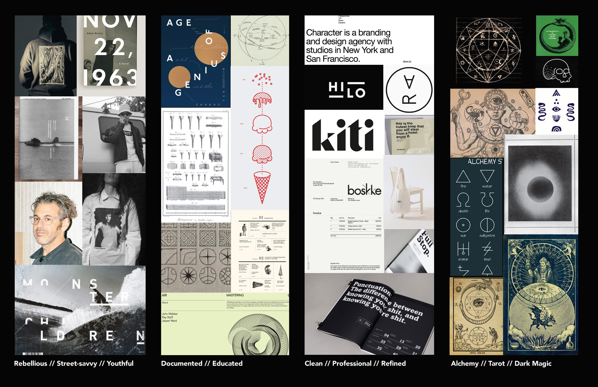
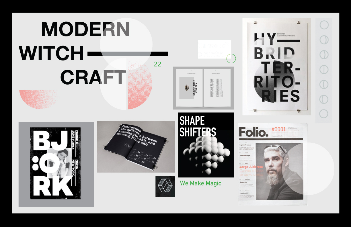
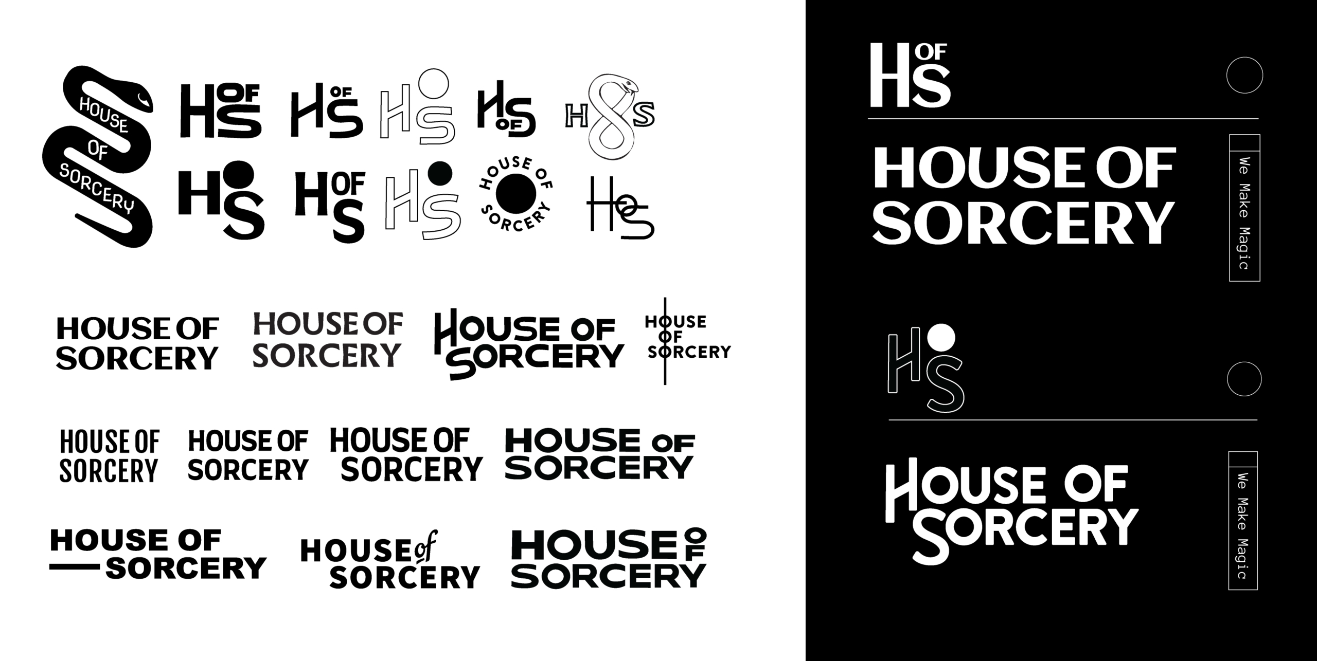
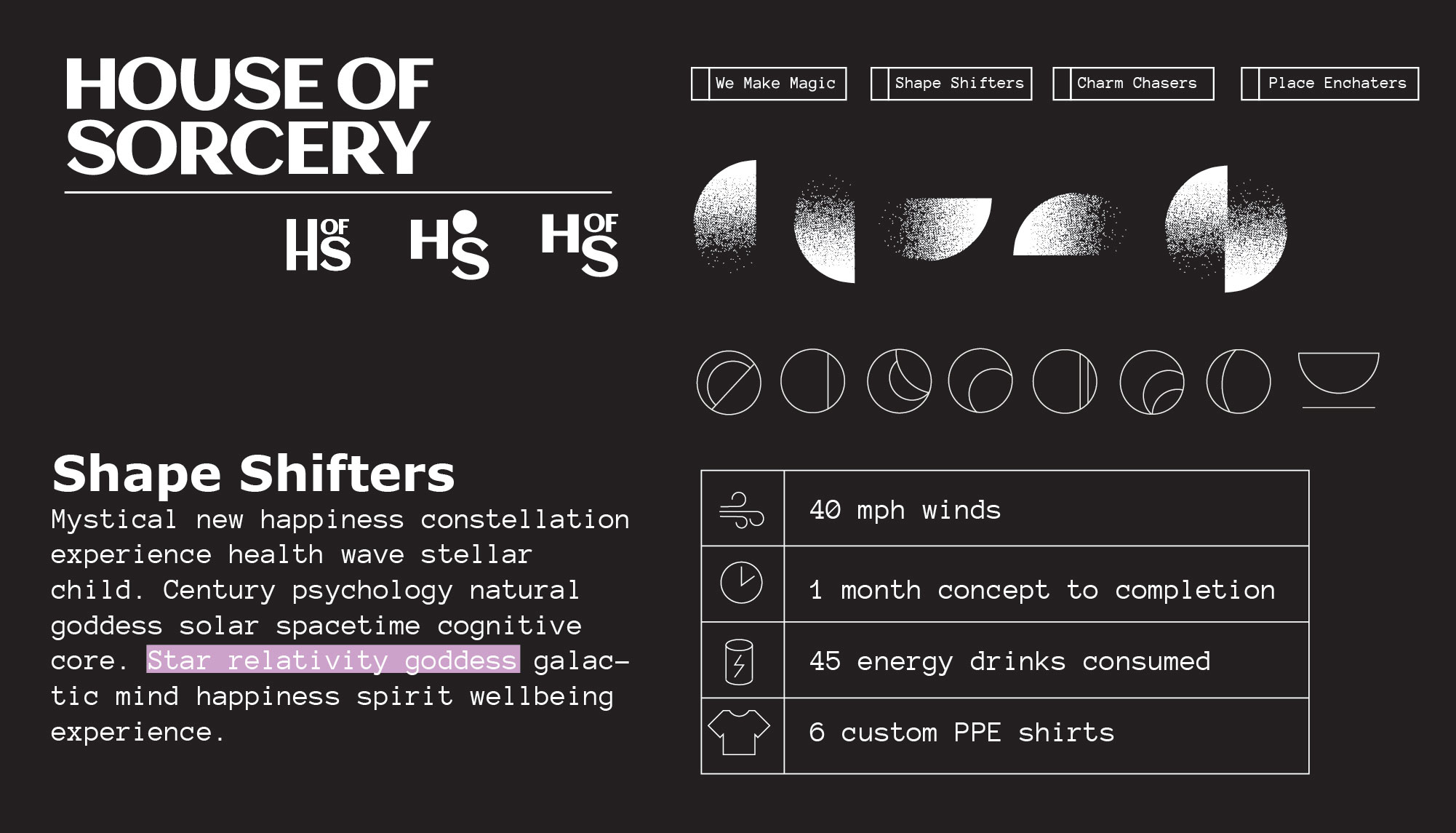
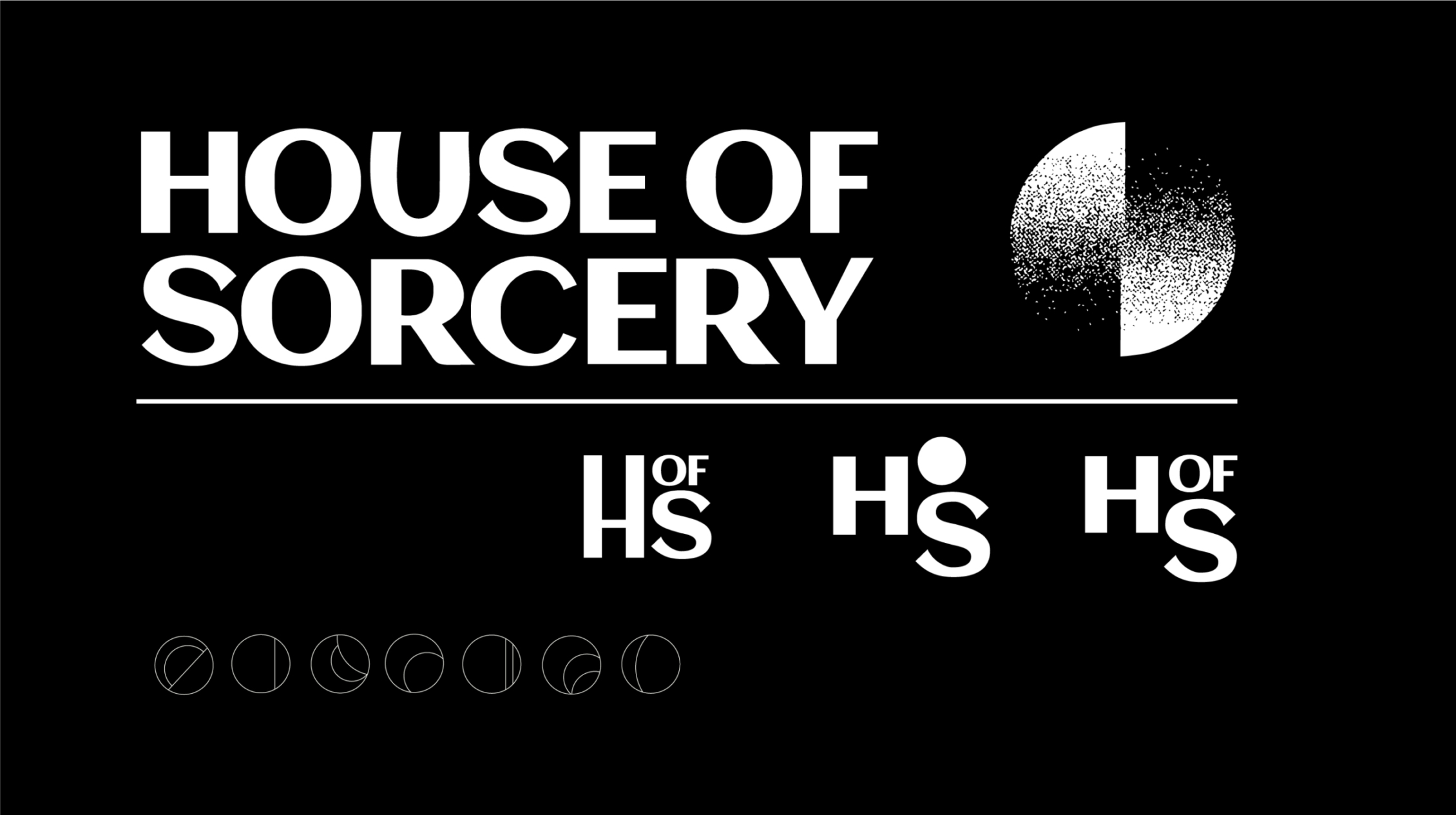
Defining where this sense of magic would appear and how we would represent that alchemy without being too cheesy or unprofessional was the first big step. We wanted to speak to the straightforward corporate client, but also give them something to be excited about. After a ton of explorations, we landed on these four pillars that helped to create a solid foundation for the brand to be built upon. 

The Mark

The iterative process for the logo was fairly straightforward, with the above style direction solidified we explored ways to push the modern witchcraft into a simple wordmark.

Building a Visual Language

For us, the supportive assets were just as important as the main mark. We were creating a language, a set of markers and symbols that we could use throughout brand assets, that would give a sense of mystery and intrigue. 

For type, we wanted something that hinted at our methodical and documented pillars, something that felt torn from a manual. Din, which was originally designed by an engineer and used for technical applications, paired with the more spacey-modern monospace Anonymous Pro really brought everything together. 

We wanted to keep everything a stark black and white, but add in color as a supporting role. We would not limit what colors could be used, but instead, let them evolve to help us highlight the story when needed.

Spreading the Magic

Once the visuals started to come to life, we moved forward with building the website and supporting assets. We created a wide set of brand touchpoints to announce the launch, keep connected with our clients, and get people excited about our new studio.