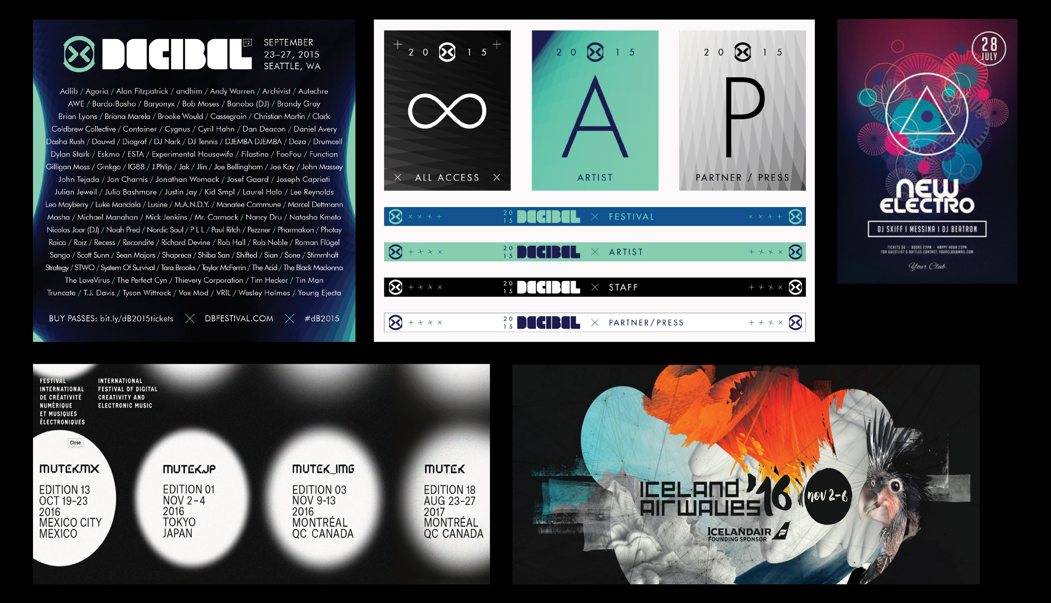
We started by researching the industry, looked at past decibel visuals as well as similar events across the globe.
Decibel Festival Rebrand
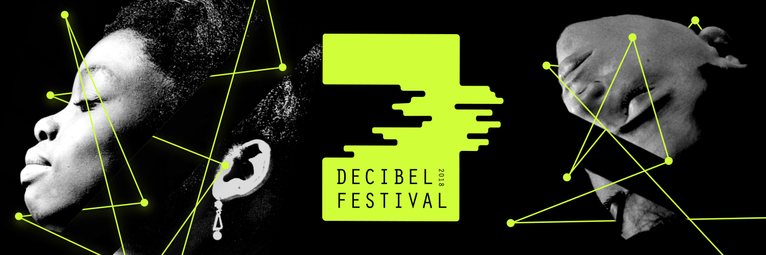
During the last week of September, more than 25,000 concertgoers flock to Seattle to attend Decibel Festival, one of the city’s electronic music festivals. While electronic music remains the main focus of the event, its founders make a point to weave elements of international multimedia art into the live performances.
 Imagery
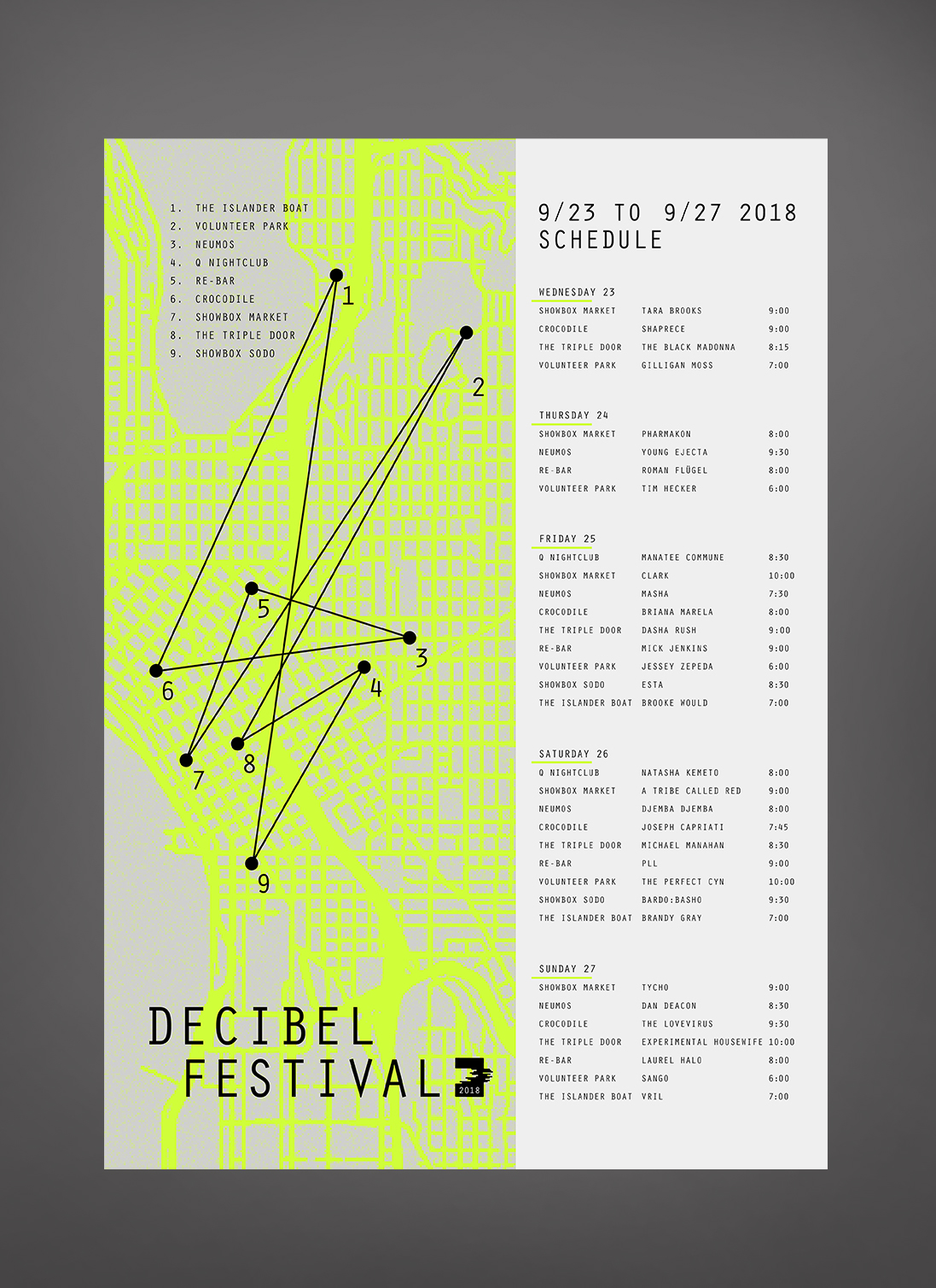
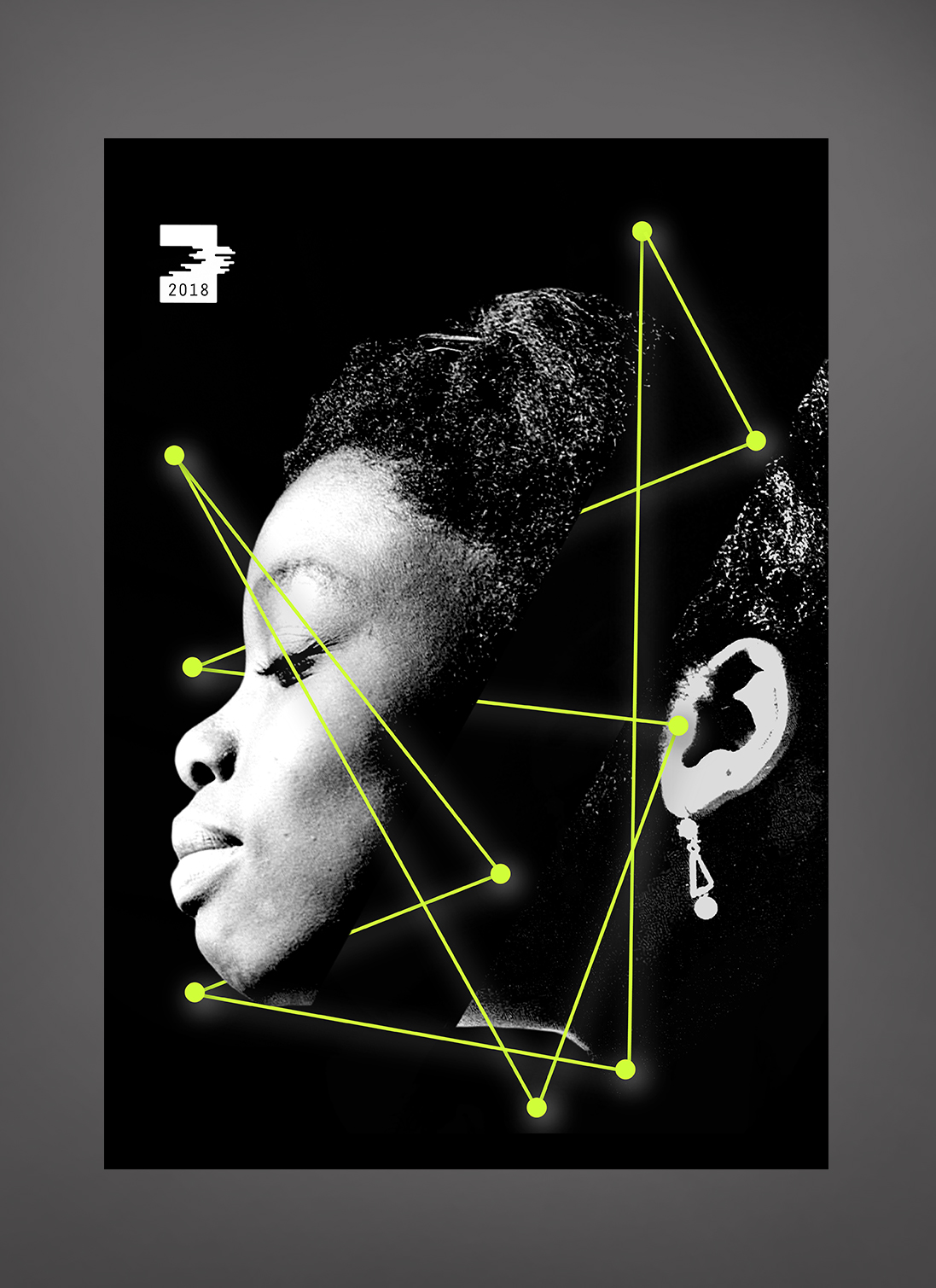
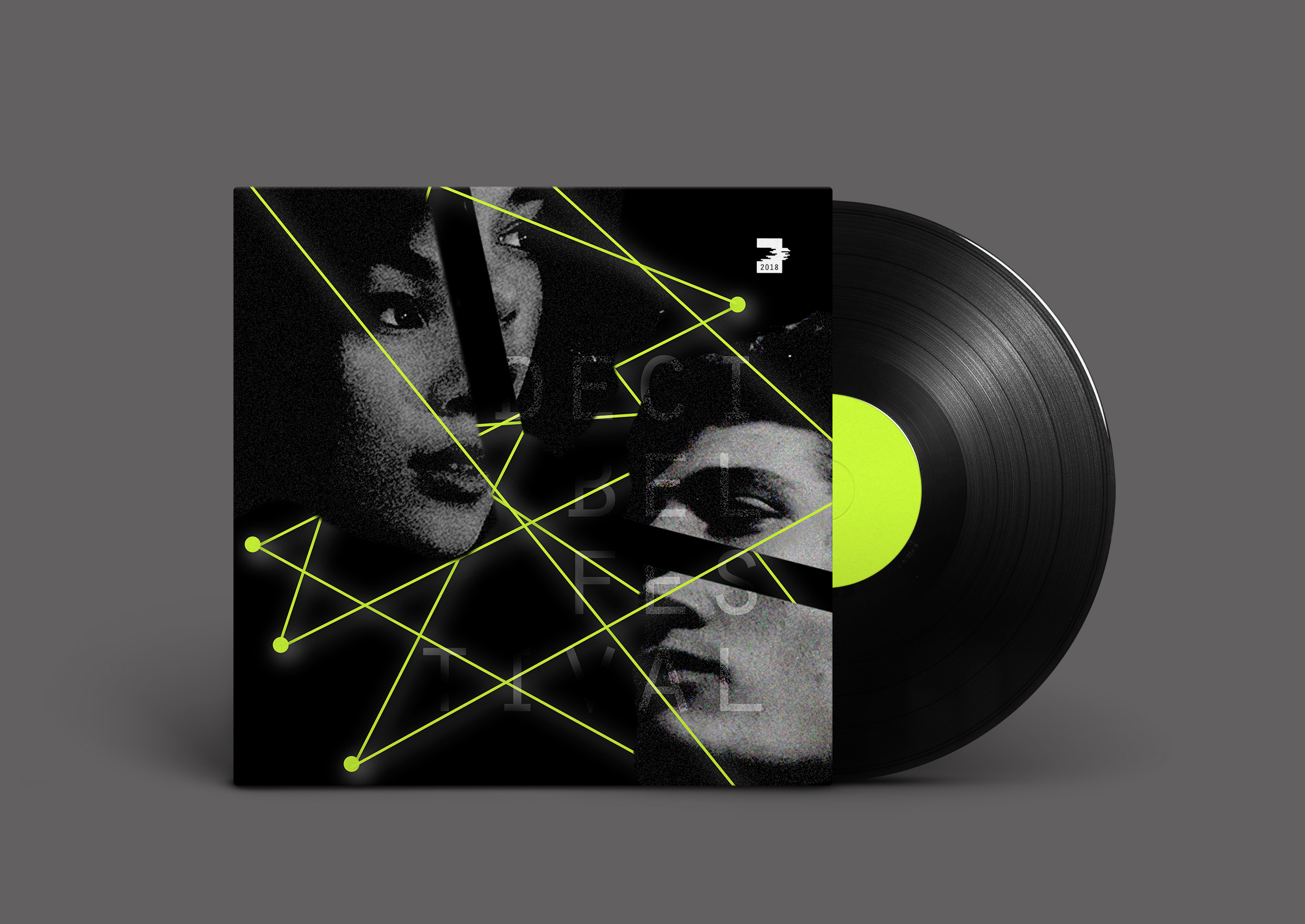
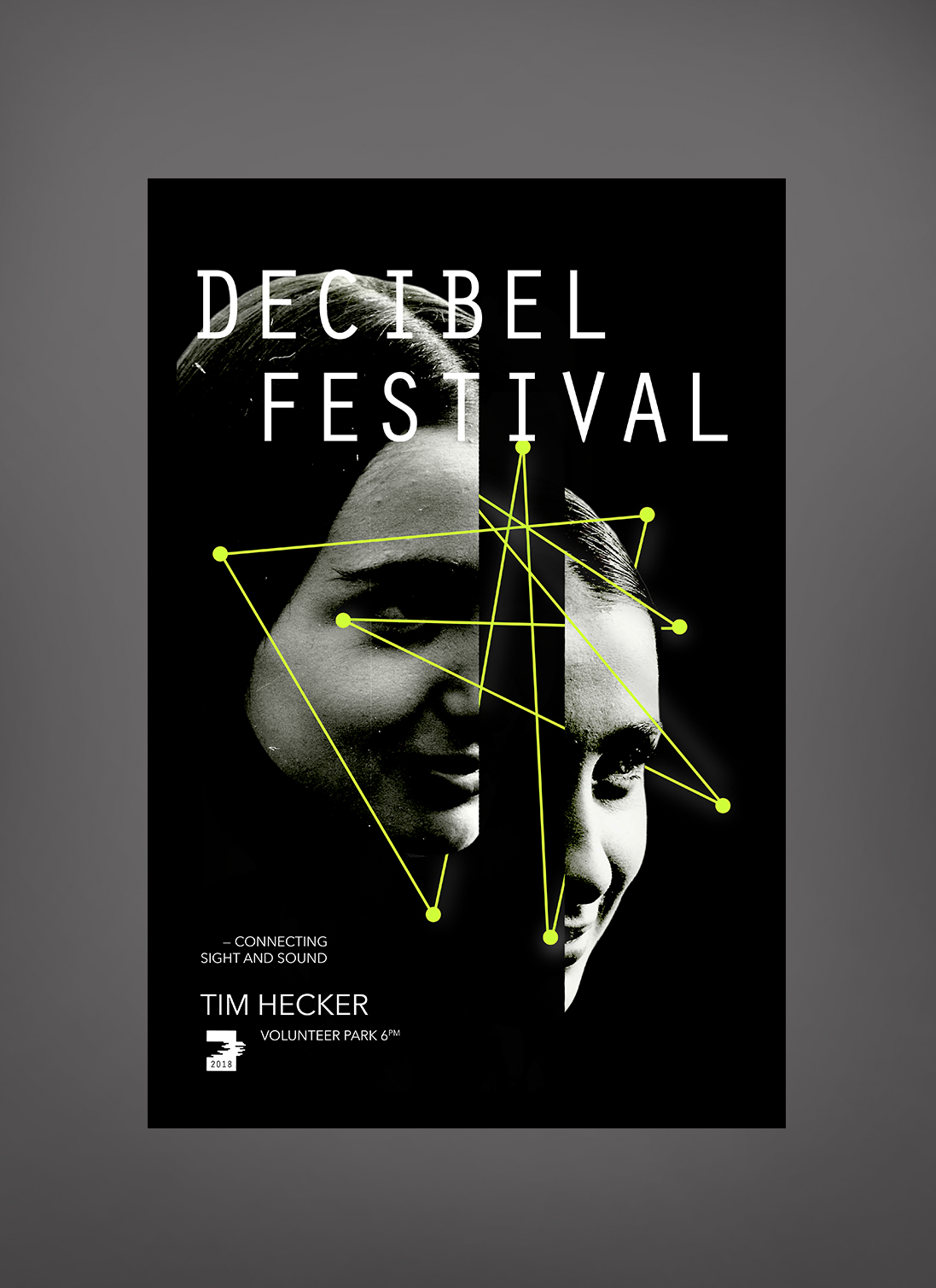
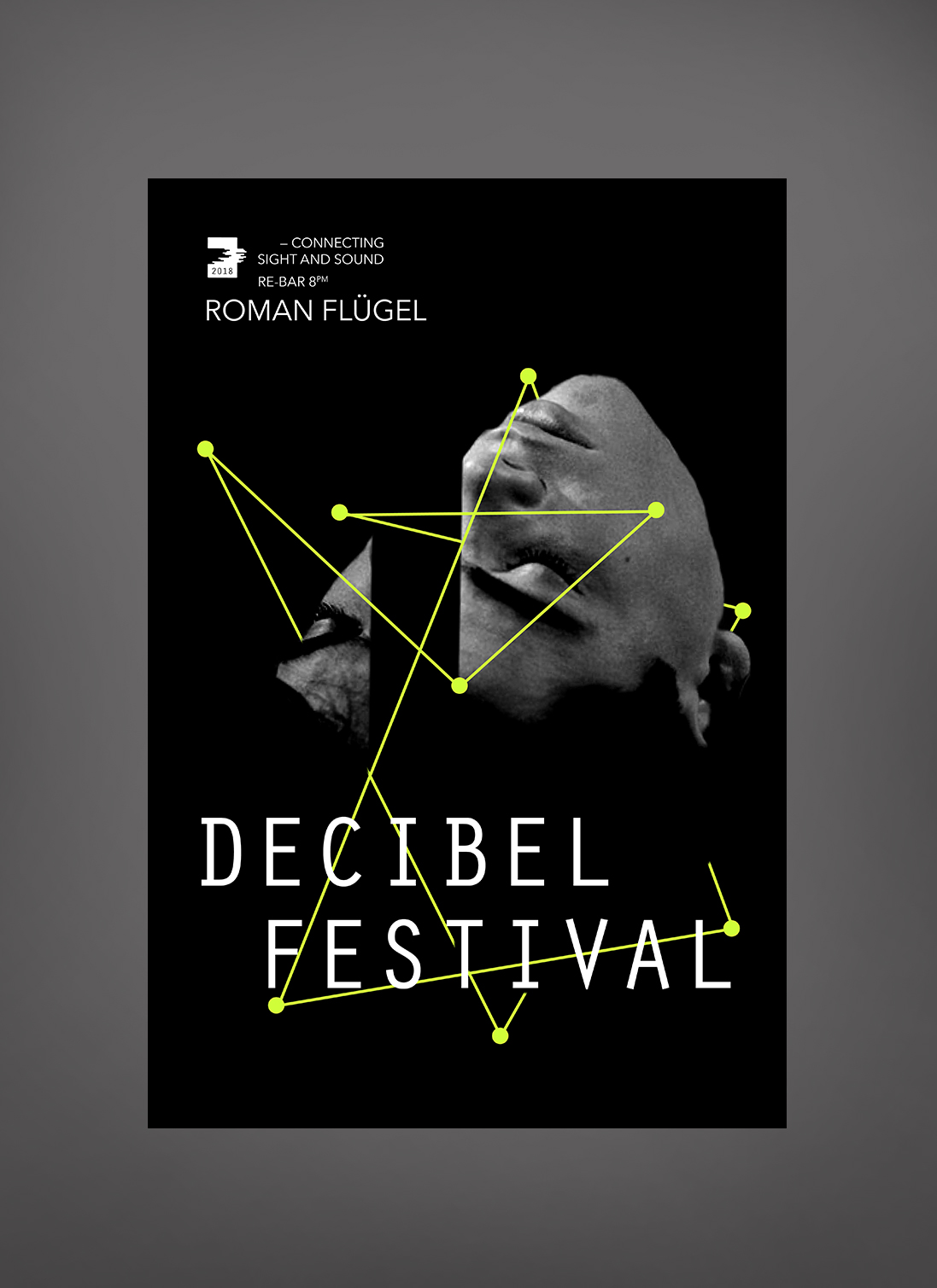
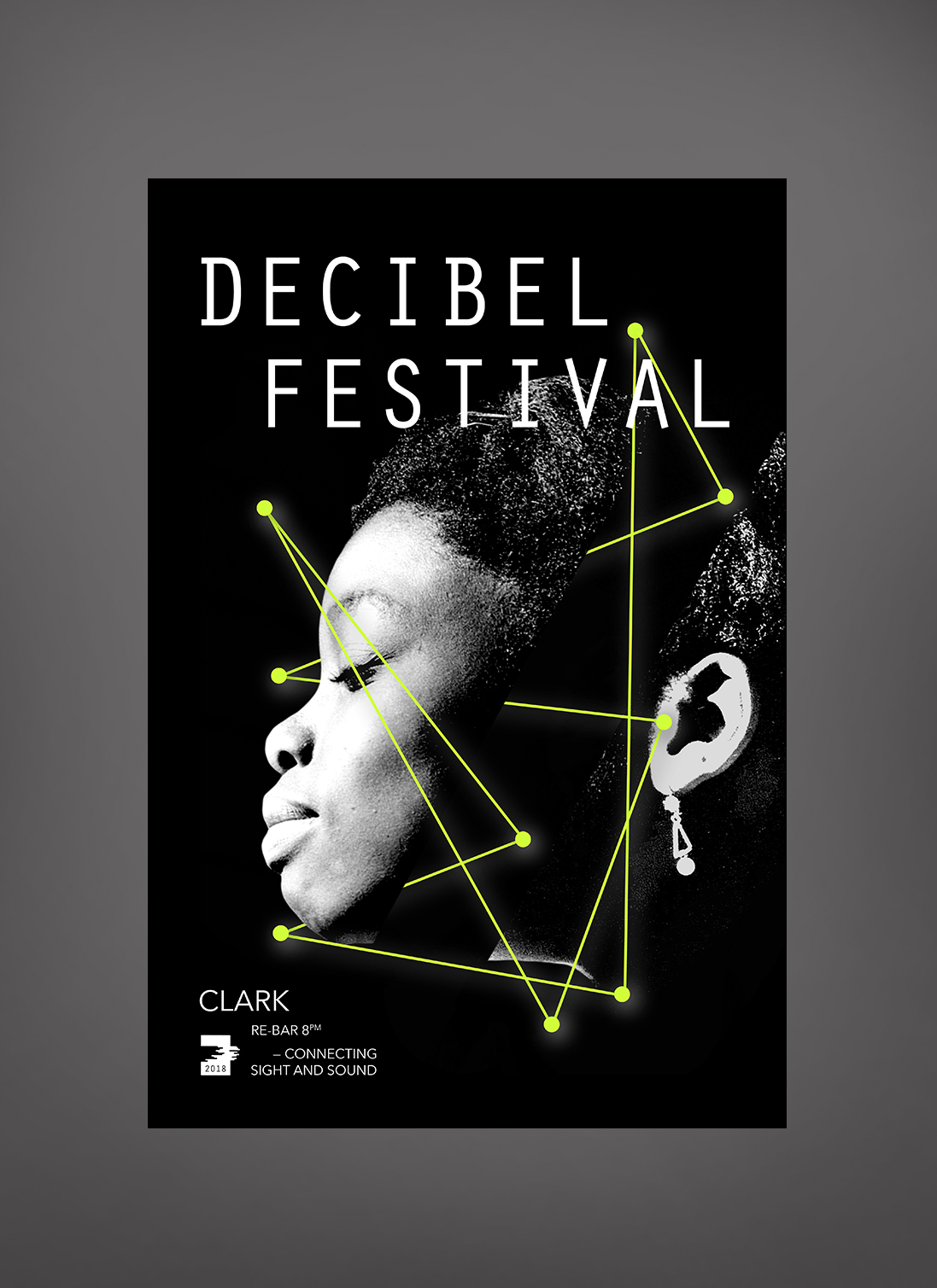
Imagery for this festival needed to feel abstract and pair well with the experimental and grungy sides of the music and art displayed. We created a system of broken heads and connections emulating the Decibel map. This imagery can easily be translated throughout print and digital platforms to bring consistency and recognition to the brand.
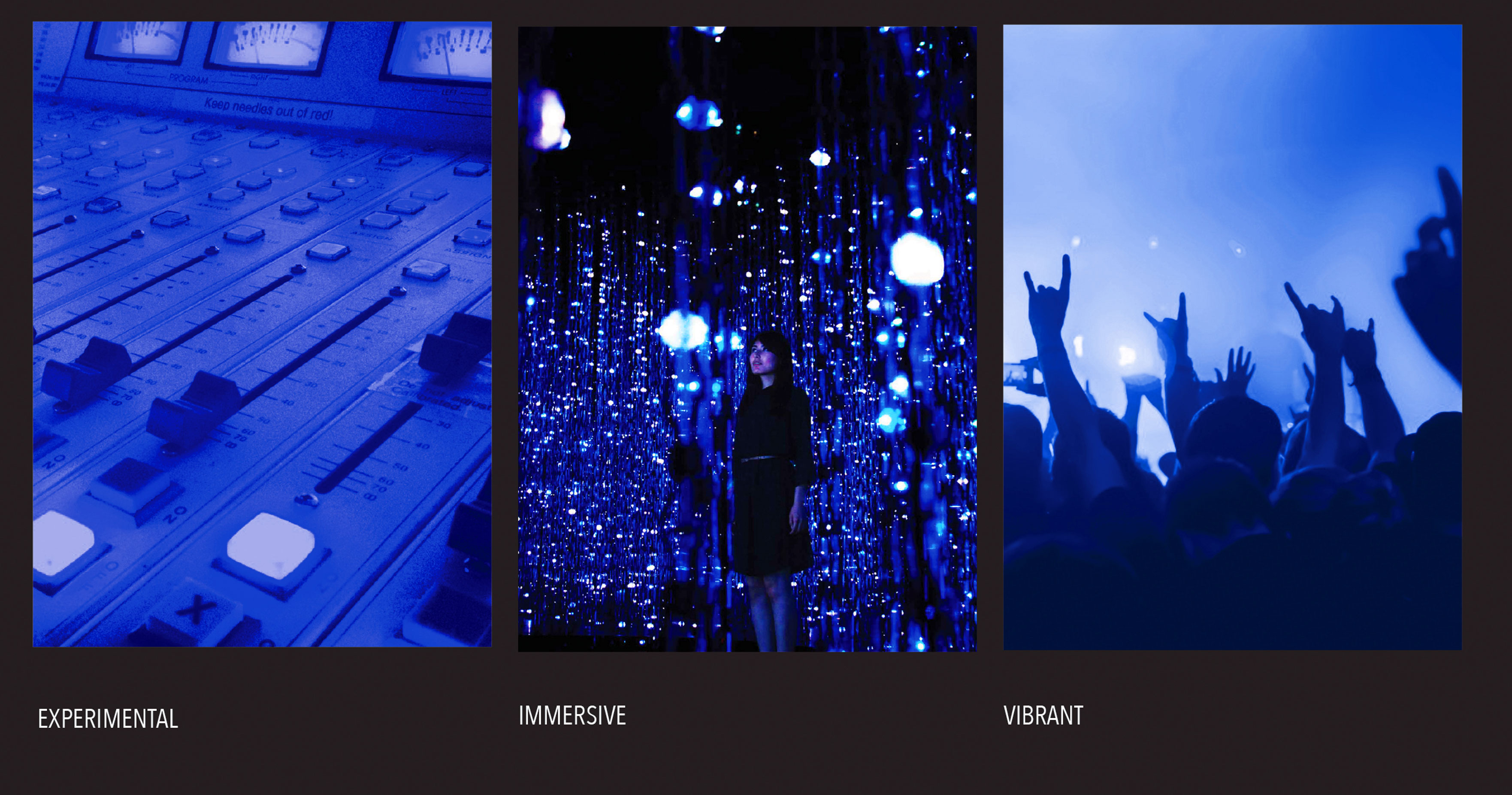
We broke down the festival into brand pillars, defining who decibel is to their dedicated followers, and who they could be to new clientele.
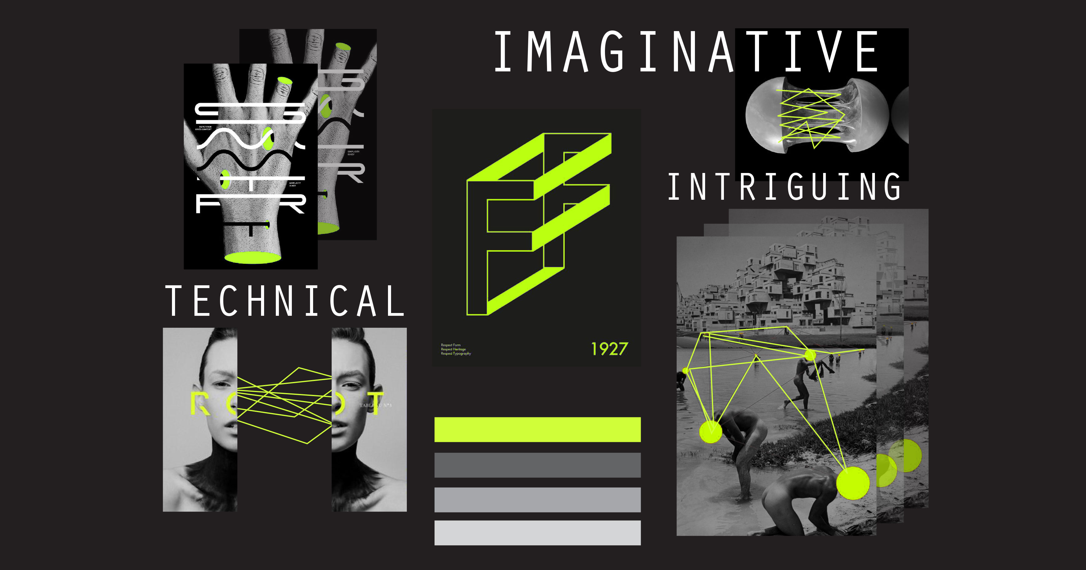
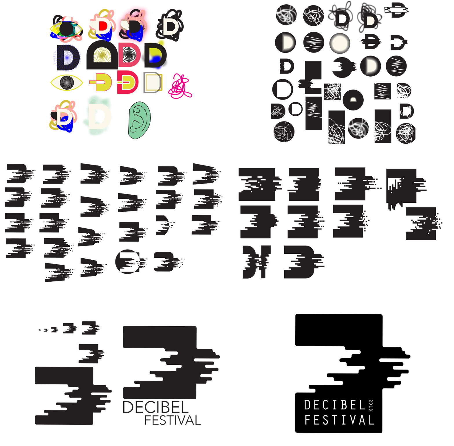
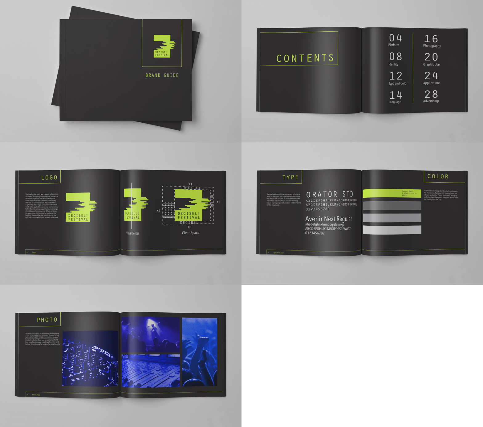
For logo iterating we wanted to highlight the idea of disrupting the mundane, showcase the technical parts of the festival and point at the fact that Decibel creates a wide variety of events all under one figurative roof.
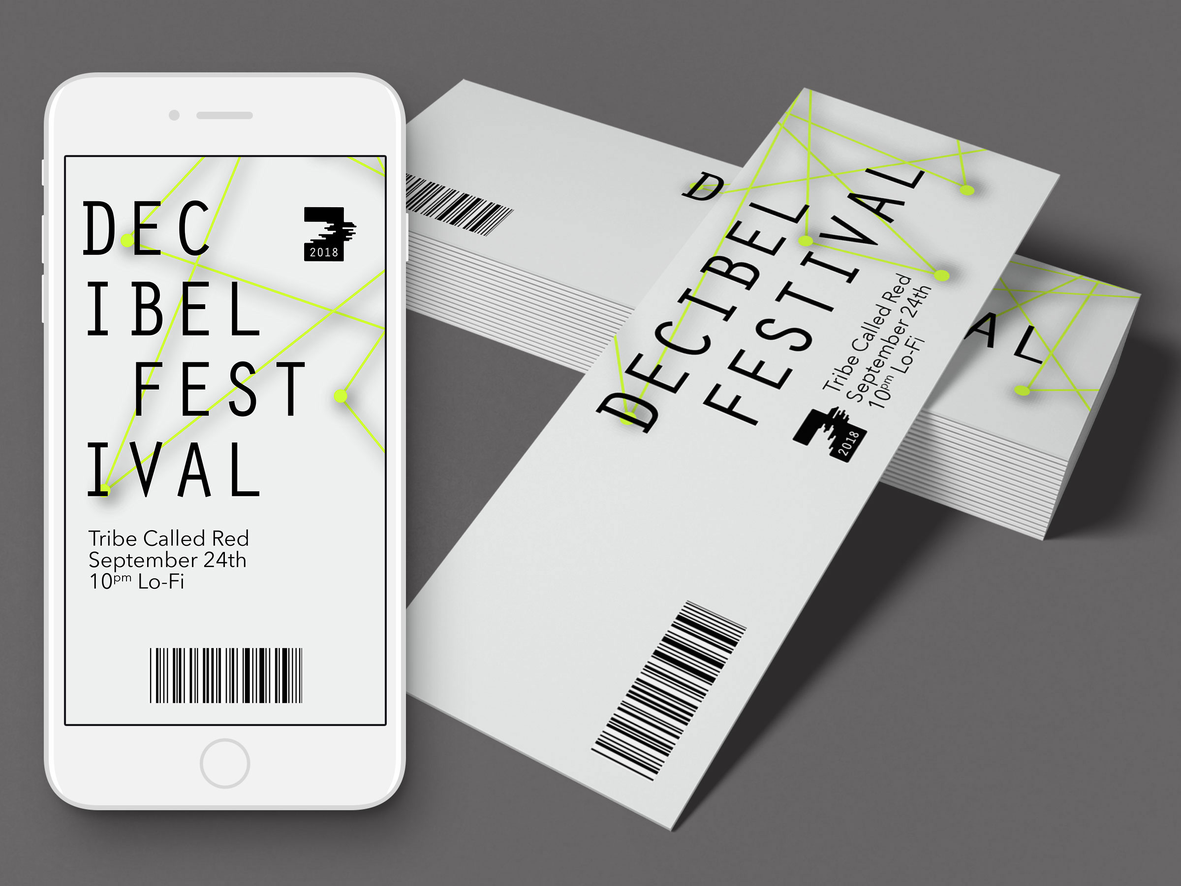
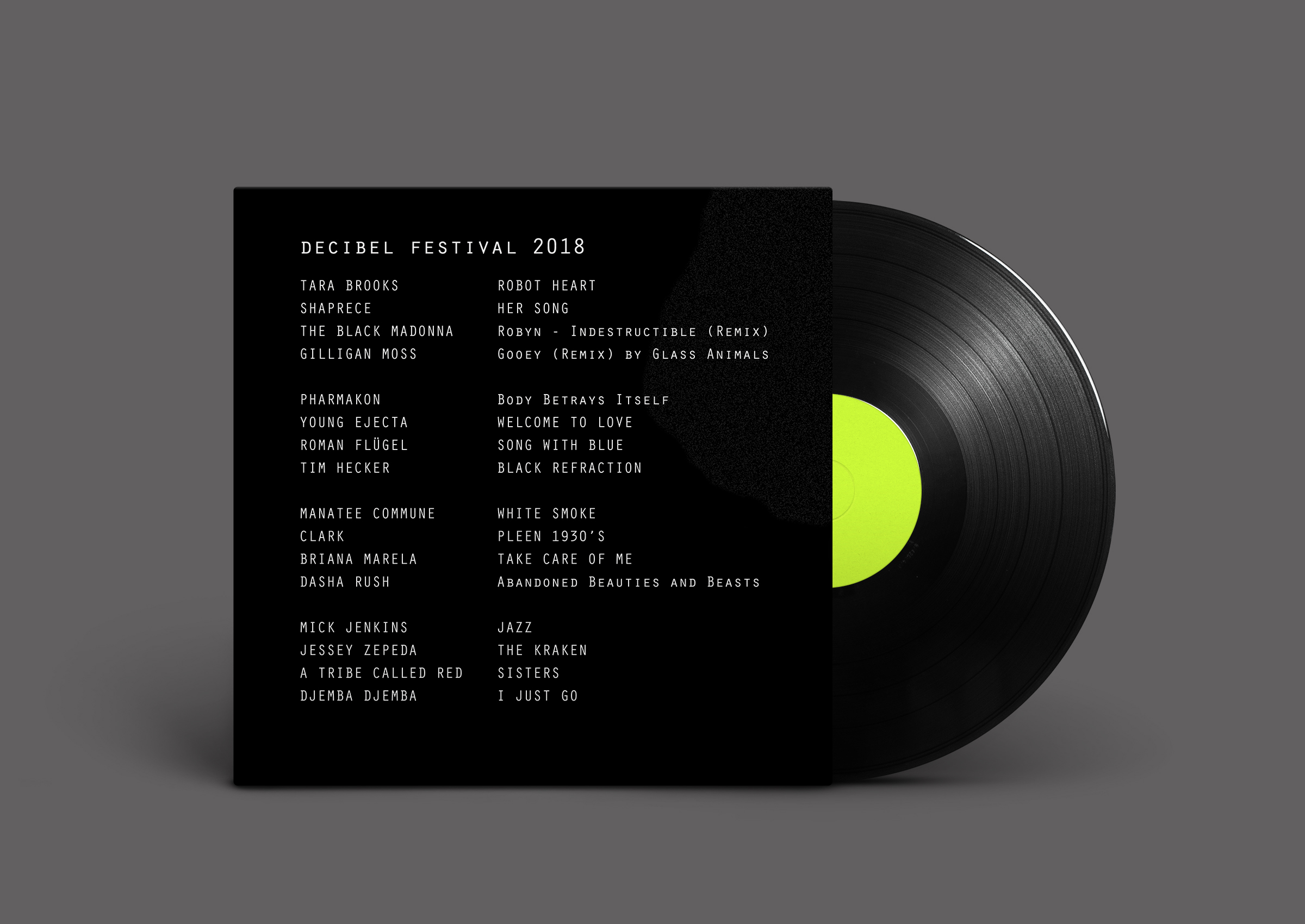
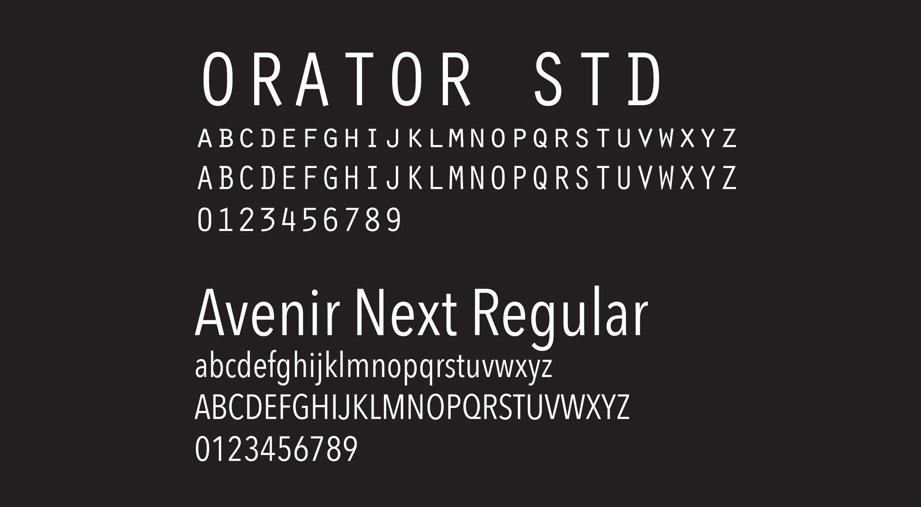
The typeface Orator STD was selected to bring a sense of electronic and experimental nature to the brand and will only be used in headlines and titles. Avenir Next Regular should be used for subheads, body copy or any important information on tickets and similar documents.
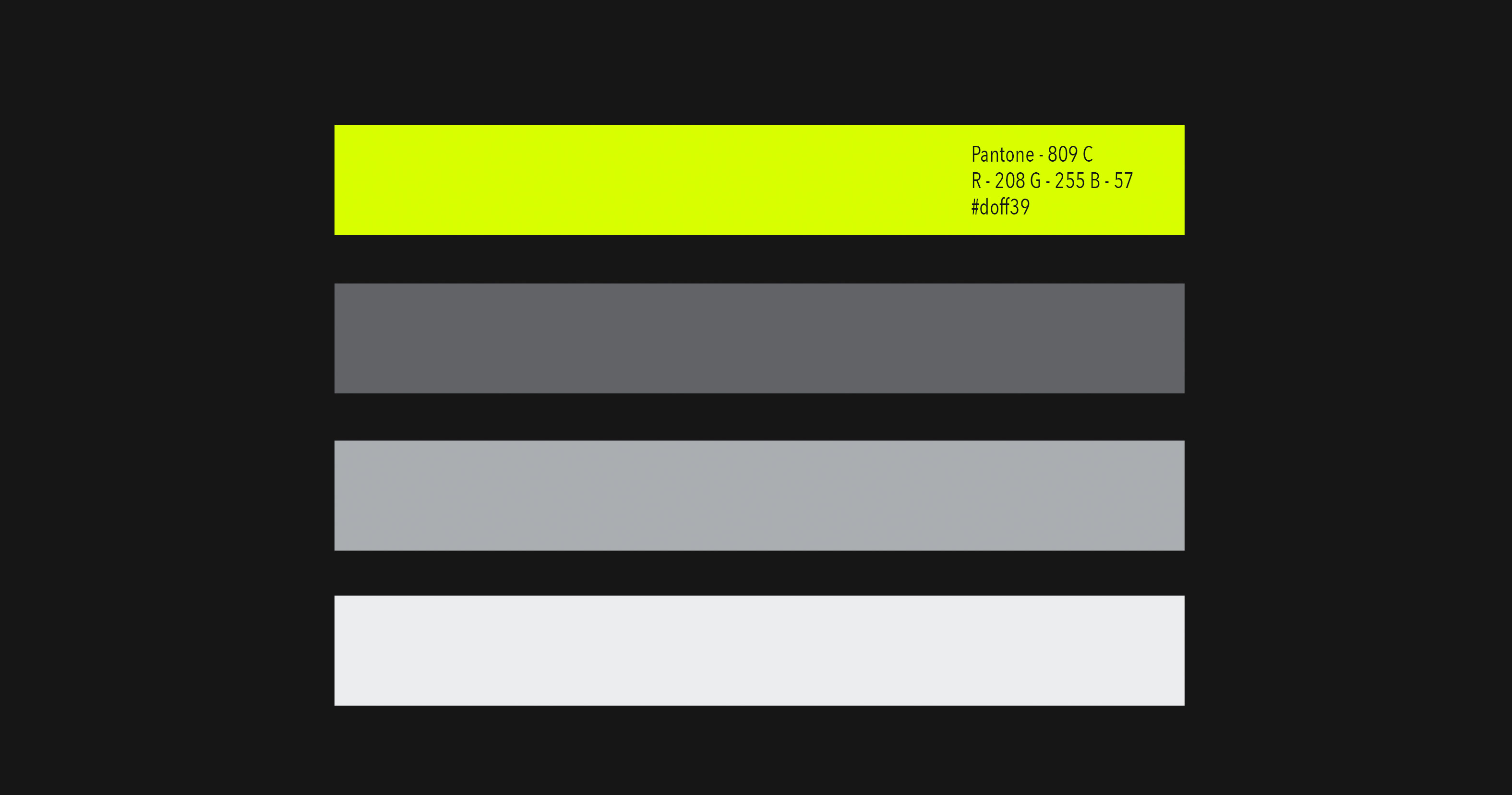
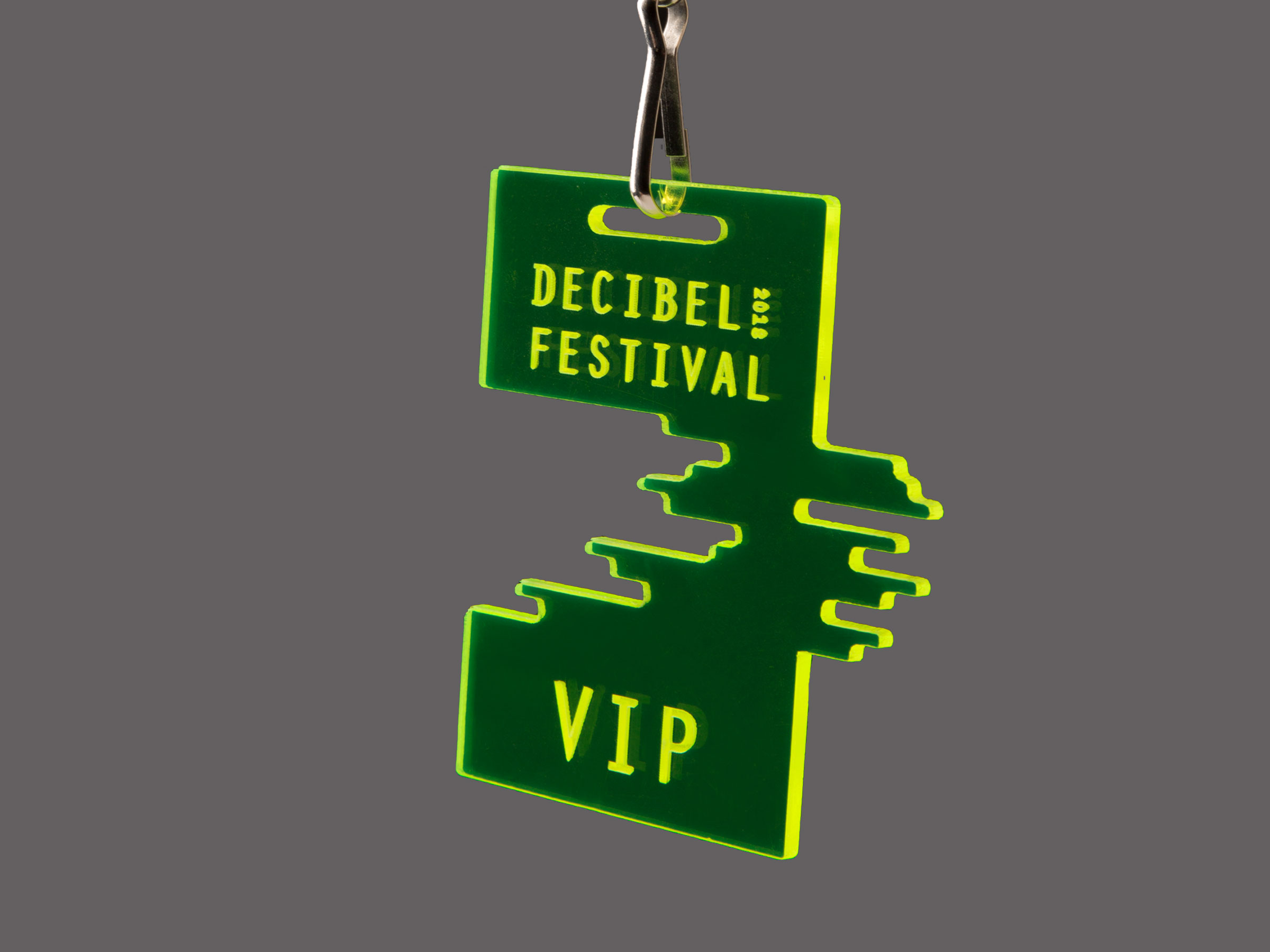
To drive the message that Decibel cuts through the mundane, a day glow green spot color was chosen as a vibrant indicator for the festival. Paired exclusively with grayscale, the green helps the festival stand out throughout the city, and makes items such as tickets and the festival guide easier to see inside of the darker venues.