One of my favorite things about being a designer is the opportunity to dive deep into any industry. Finding out the specific intricacies and obstacles that they face, and being a fresh set of eyes in their work is such a pleasure. The mining industry was something I went in completely blind to, I was grateful to be able to work with the internal marketing team, a PR firm and the executives at DataCloud, who taught me about drilling, types of metals, the industry at large, and the very traditional workforce we’d be targeting.
DataCloud
Branding | Layout | Visual Design
Digging into the Future of Mining
Duration
3 months
Roles
Research | Branding | Graphic Design | Photo-Styling
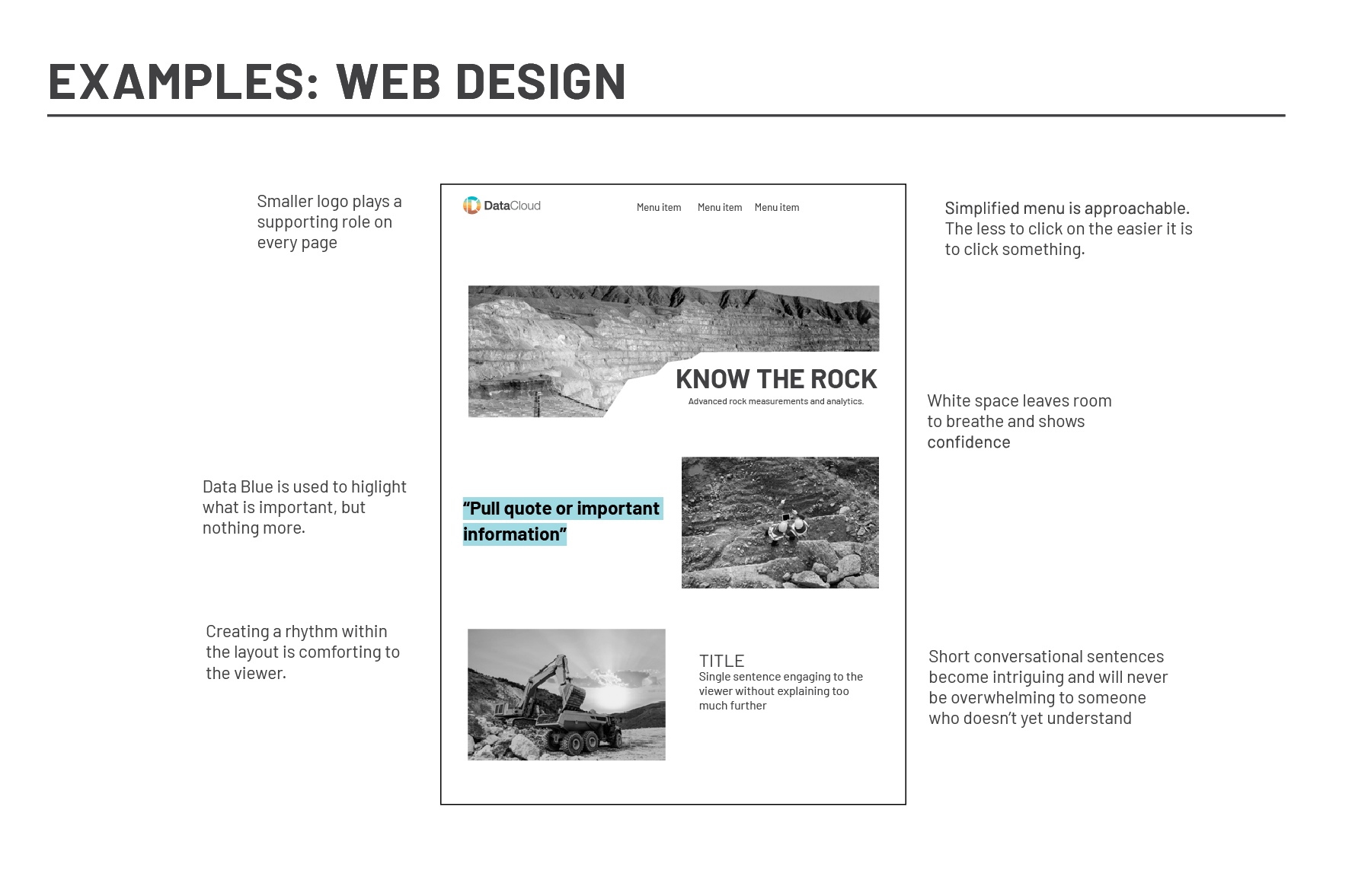
DataCloud came to me with the challenge of explaining and selling their mining technology to an industry that is pretty set in its ways. What initially started as an infographic project turned into a complete overhaul of their brand look and feel. Working with their existing logo, I created a set of brand guidelines and assets to help them both fit into this blue-collar realm and stand out as the next exciting tool for on-site mining.
R&D

 The Mark
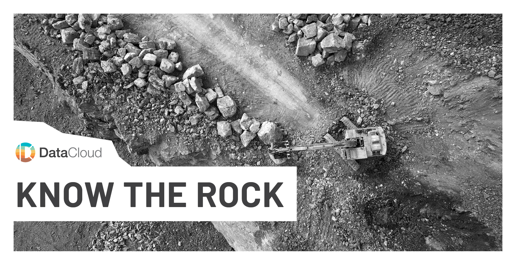
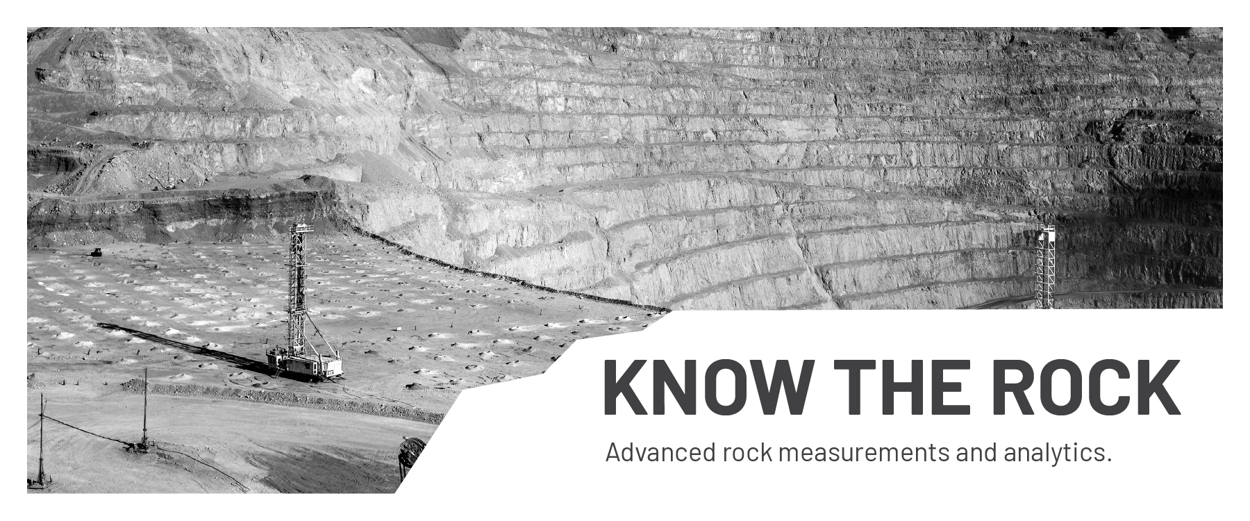
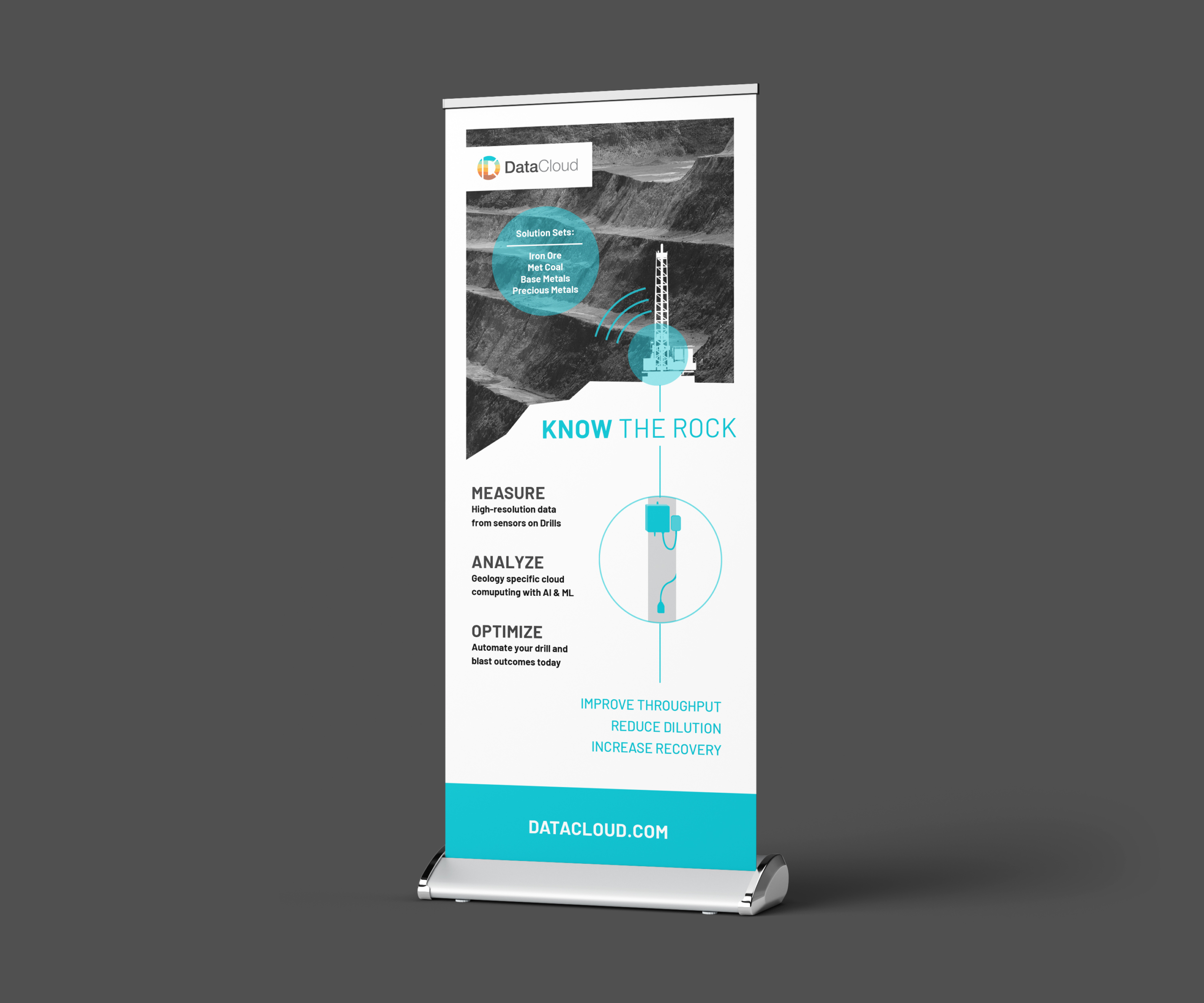
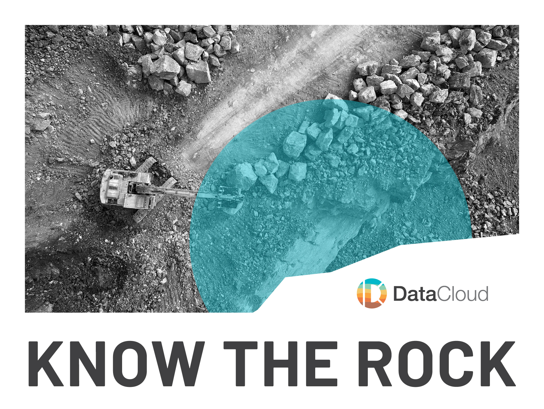
 The Banner
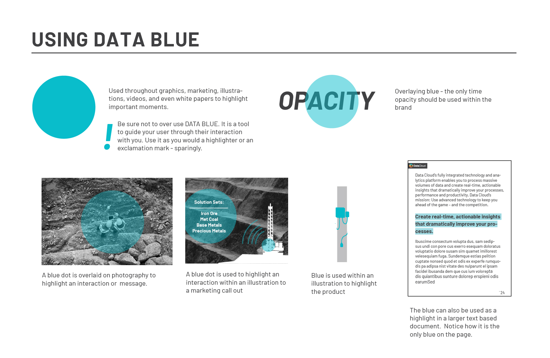
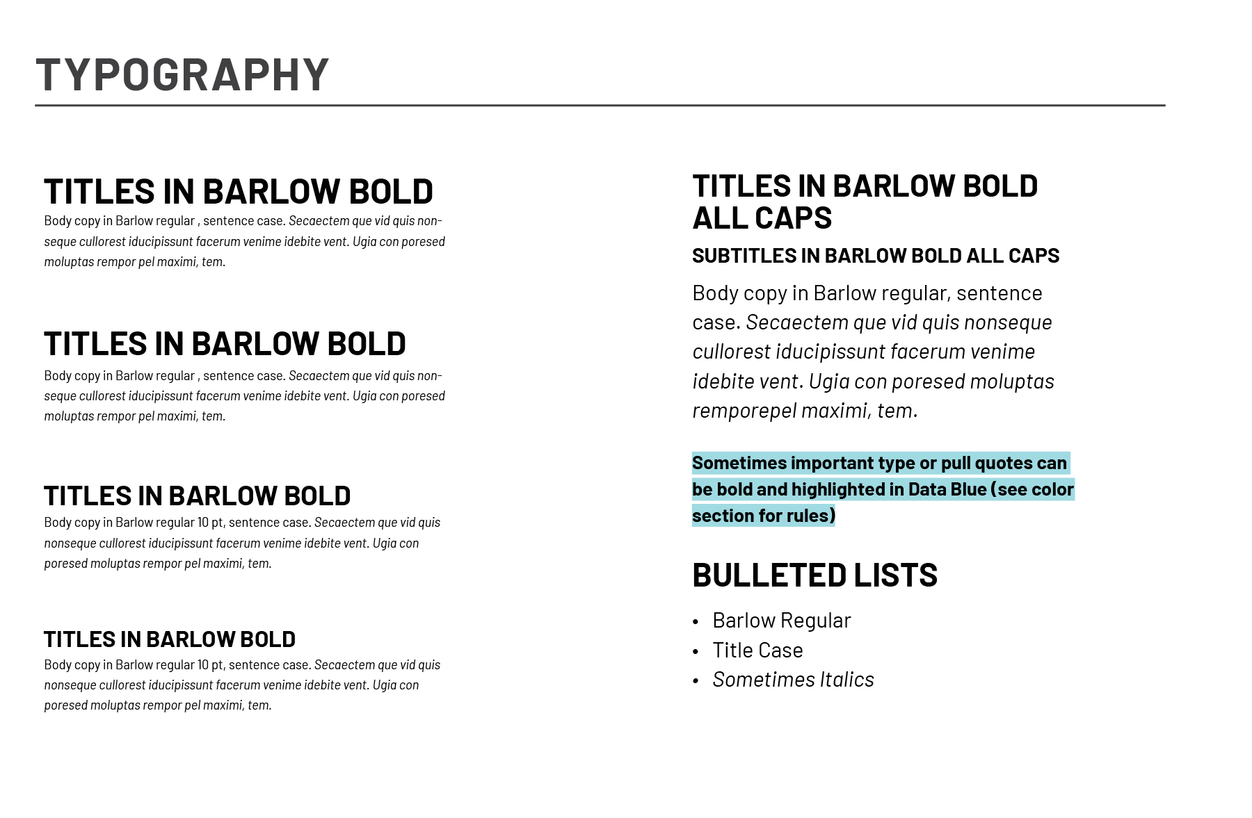
 The Guidelines
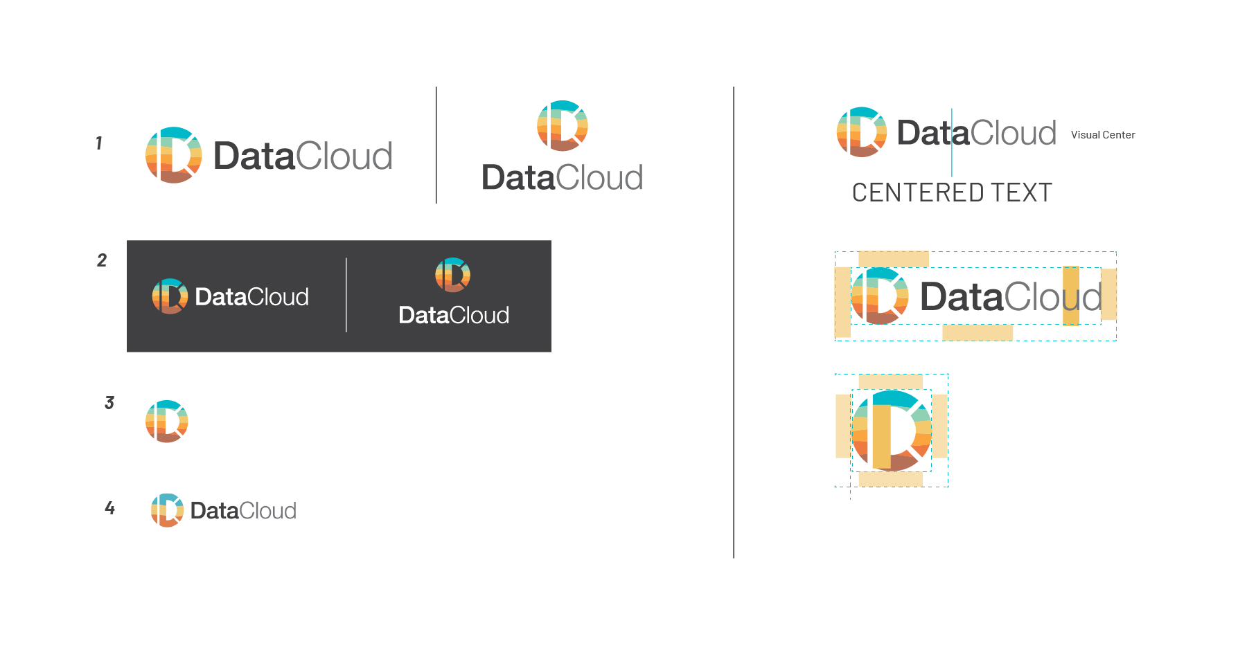
The Mark
DataCloud was not in a position to change their logo but their team was struggling with consistency, placement, and usage. When working through the brand refresh we worked out ways for their seven color brand mark to be used simply and cohesively throughout their brand touch-points.
For this project, a sudden need for a banner expedited the entire process. Based off the initial infographic I had made for them, we iterated and quickly produced this banner for an international conference. These iterations and the final design would lead the narrative for the rest of the re-brand. Luckily, having been onboarded and partway through the branding process, this sudden need actually worked in our favor, expiditing everyone’s decision making process and pushing the project on an even faster track.
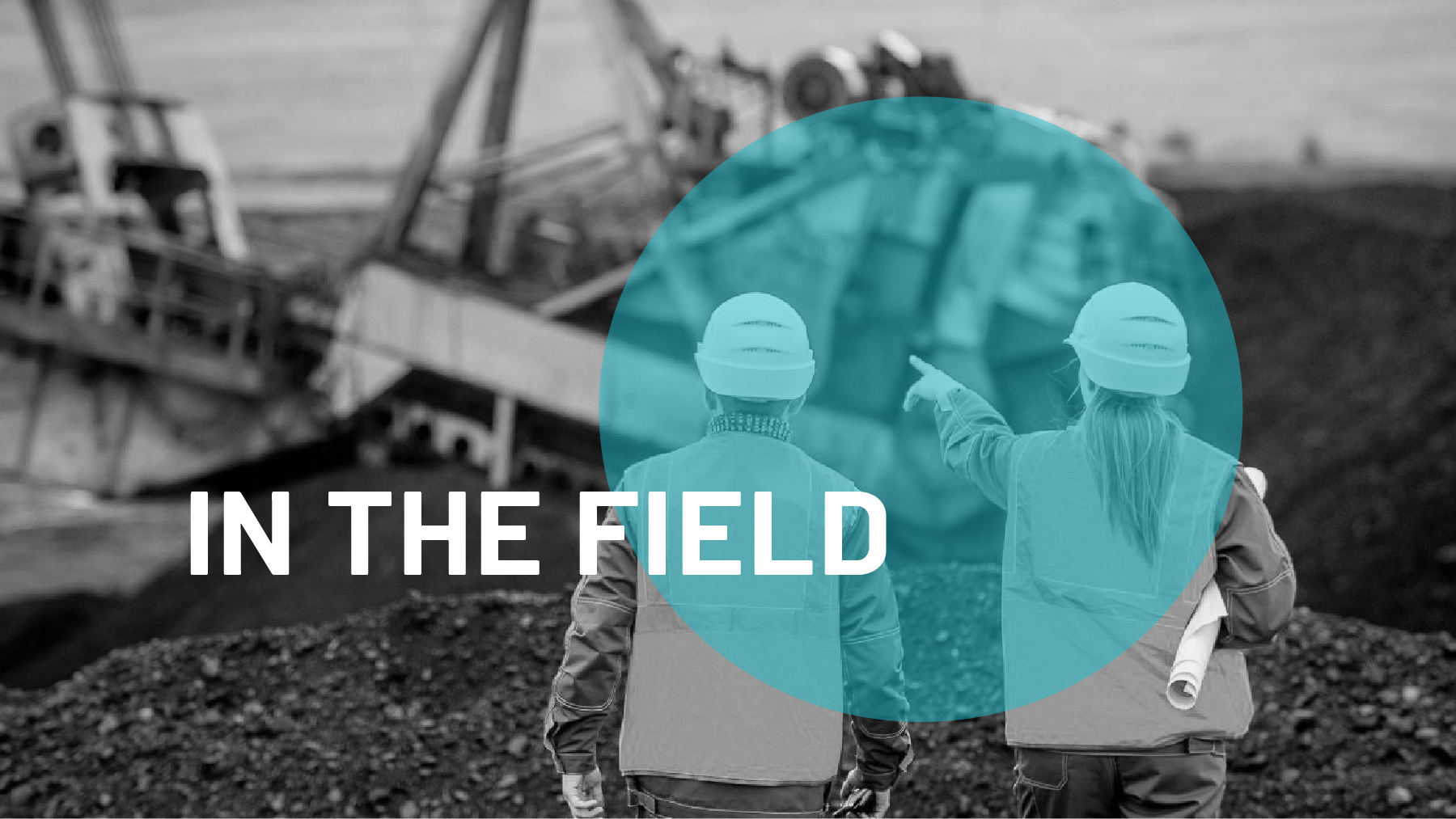
This direction was chosen primarily for its ease at fitting into the mining industry. A space where not a lot of frills or tech exists, DataCloud needed something that spoke to the blue-collar workers and traditional mining company executives. Bringing advanced technology into this industry meant simplifying, blending in, and laying a comfortable ground to introduce a subject not everyone is comfortable with. The simple color palette and straightforward layouts fit well into the conference where graphic design was not very active. DataCloud began to stand out as something different, in an intriguing, not intimidating manner, and continue to grow their international business partners. With a dedicated marketing team and a handful of contract partners, I left DataCloud with a set of guidelines, checking back incrementally to see how things were holding up.