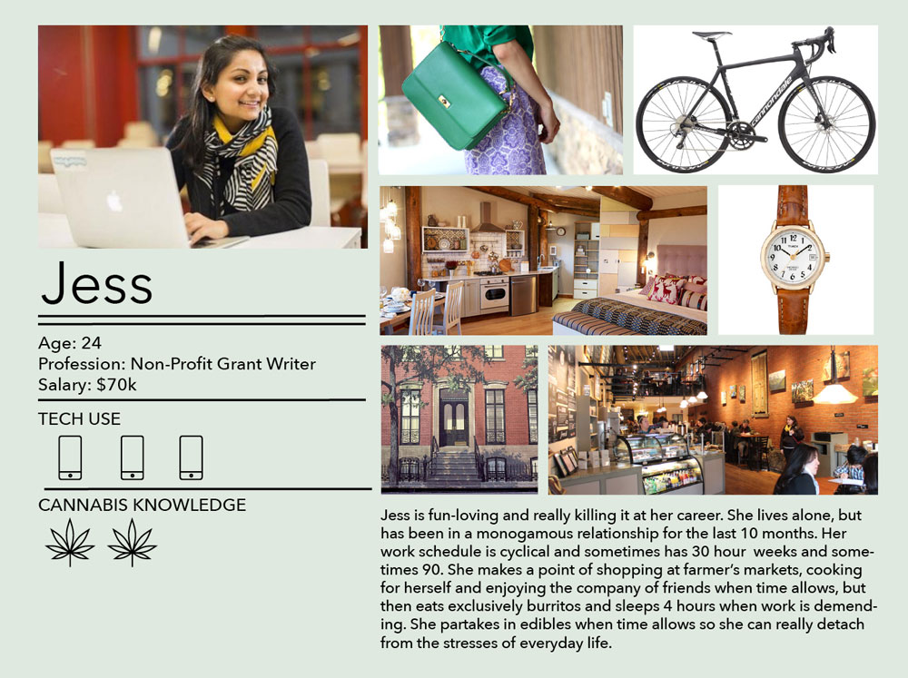
Since Mile High is heavily focused on it's affluent, hesitant users, we created a variety of personas. Our users range from little to no Cannabis knowledge, keeping this in mind as we designed the brand, experience, and communication was key to creating a brand that was accessible and comfortable for new demographics.
Mile High Cannabis Club
Branding | Motion Graphics | Packaging | UX
Duration
8 weeks
Roles
Branding | Packaging | UX | Animation
Tools
Illustrator | Die-line Creation | After Effects
Collaborators
Tom Eyler
A digital one stop shop for all of your cannabis needs. Mile High targets a new demographic of marijuana purchasers; those who are interested, but not comfortable with the current market. With a business model ready to bend and change with new laws, and products anyone would feel comfortable having in their home.
 Building the brand
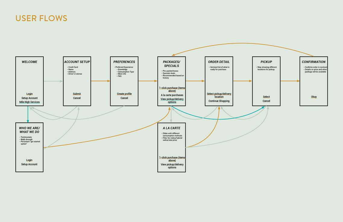
After establishing our personas we moved into our customers journey, defining what pain points were, and finding ways to navigate them as well as considering customer retention and loyalty. Creating user flows for purchasing was an important step in making our purchasing process as painless as possible.
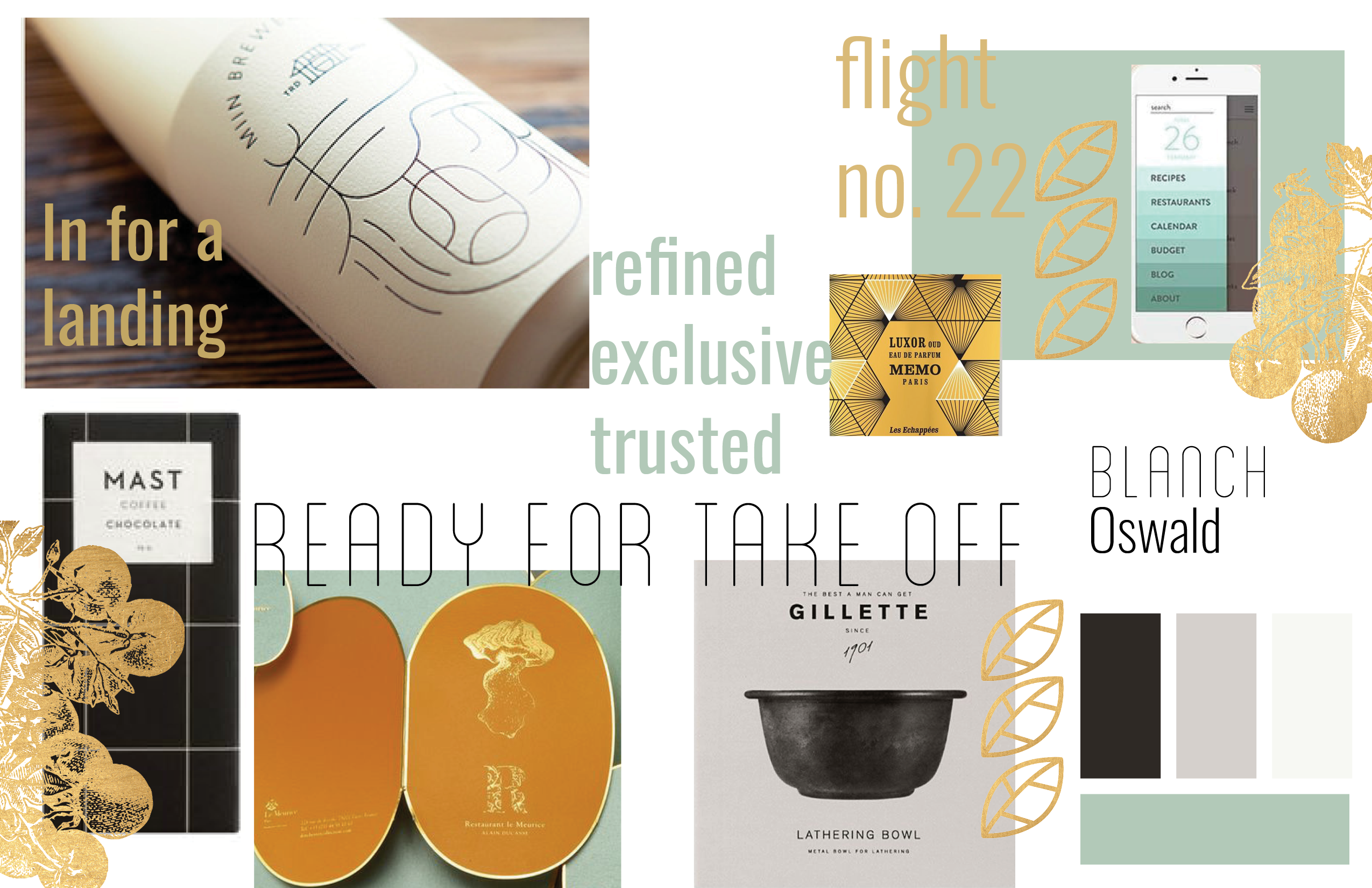
When considering style for the cannabis industry, we looked at fine chocolates and high end alcohol. Giving a nod to flight we thought about what the brand would look like in a smoke lounge of an airport in the 1960's. Blanch brings a sense of approachability and fun, and will be used in headlines and advertisements. Oswald rounds the brand off as one that is trustworthy and regulated, it will be used in descriptions and body copy.
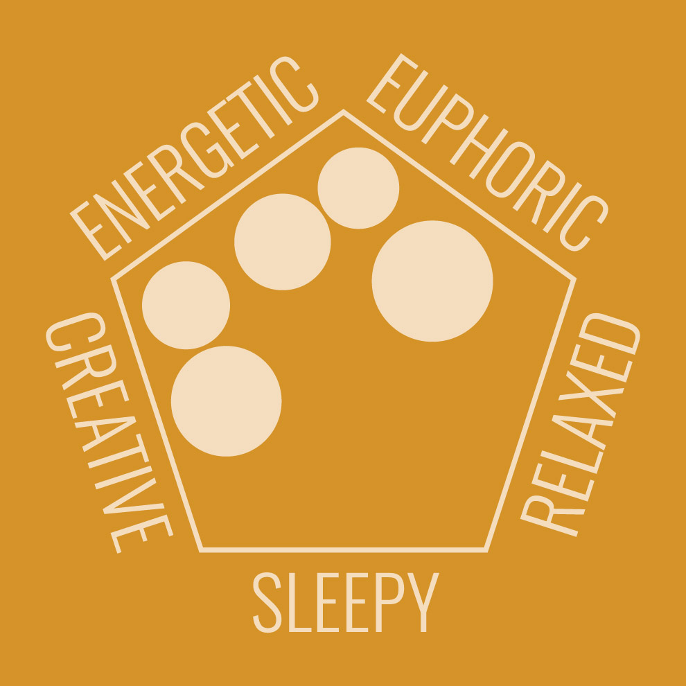
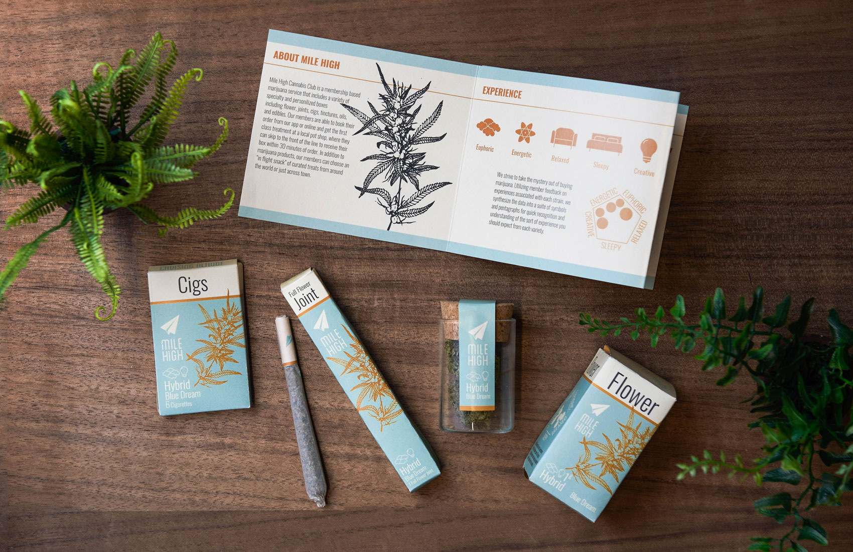
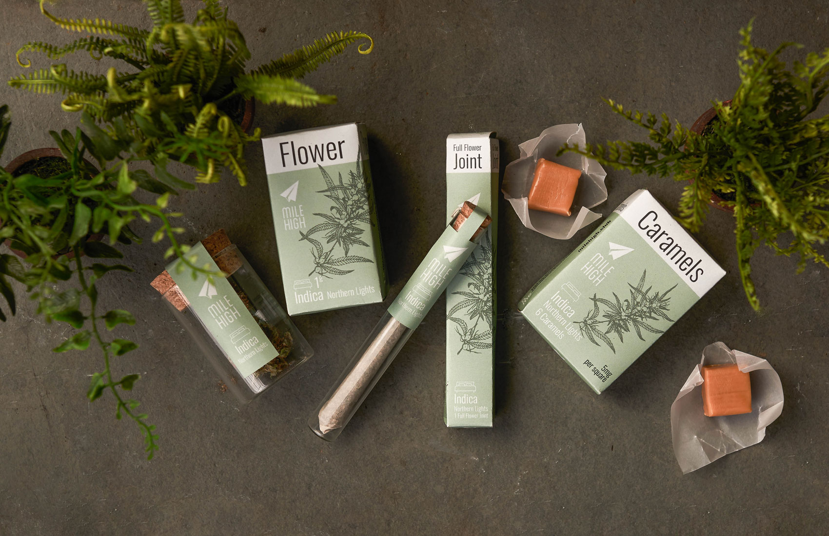
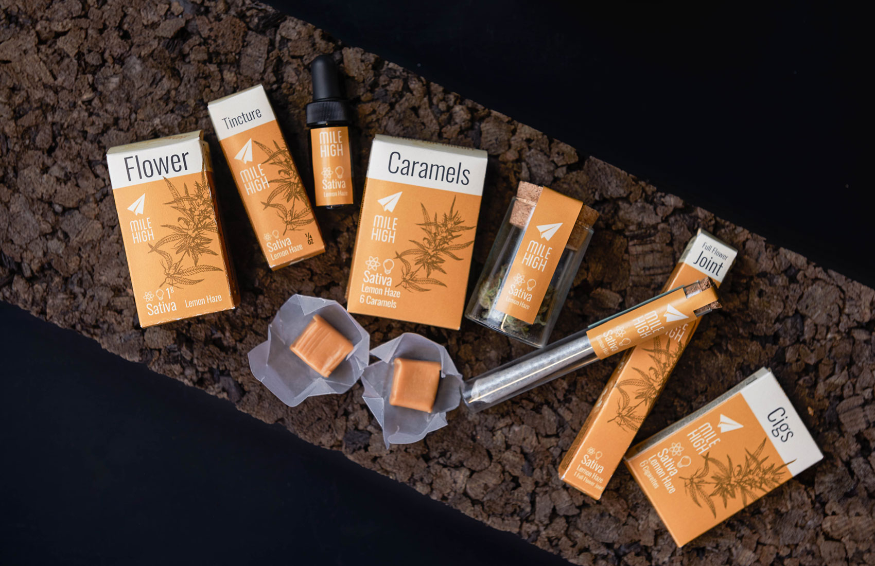
One of the biggest challenges with communicating to cannabis users is expressing the experience they will have with each strain. Through talking to researchers at Leafly we discovered that the known system of Sativa, Hybrid and Indica is mostly inaccurate. The varying experiences of cannabis come from the CBD THC and CBN chemical balances, not the strain type. At leafly they have been trying to create a labeling system that doesn’t rely on the strain type. Leafly has found that users are deeply connected to Sativa, Indica and Hybrid, so taking them out of the equation would be disastrous. We decided to continue labeling our packaging with the strain type, but to focus the labeling system around experience.
We created this chart to represent the different experiences reported by users of each plant. Because the experience can vary between consumers, and one consumer tends to have a few strong experiences per strain we found that this chart was a nice way to express those personal experiences.
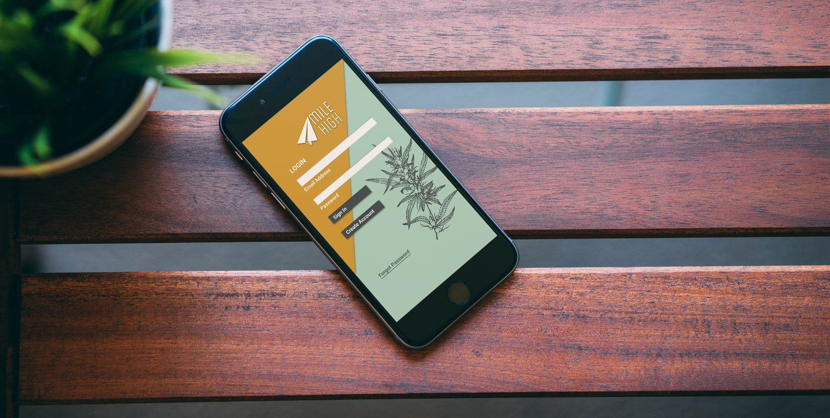
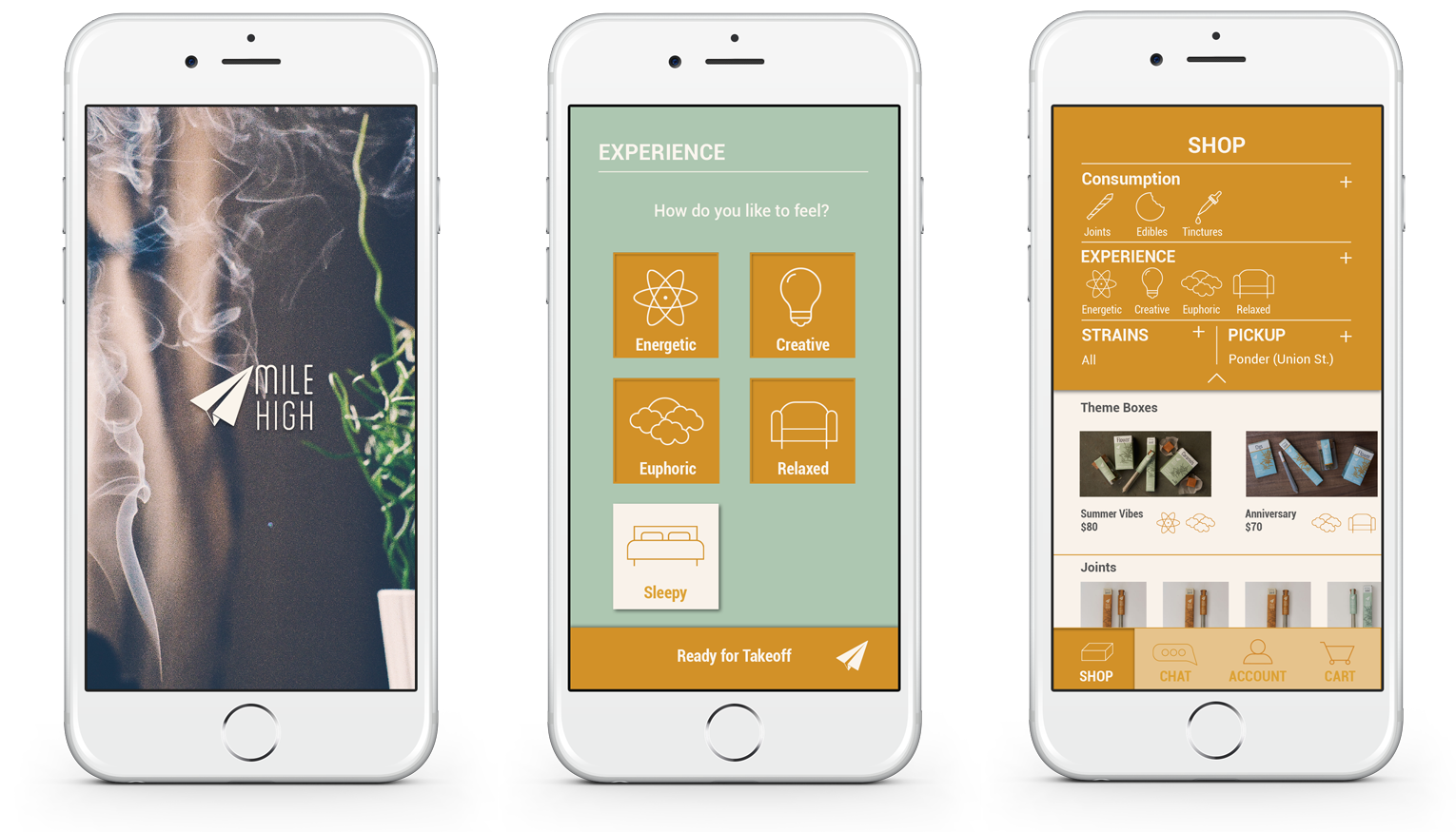
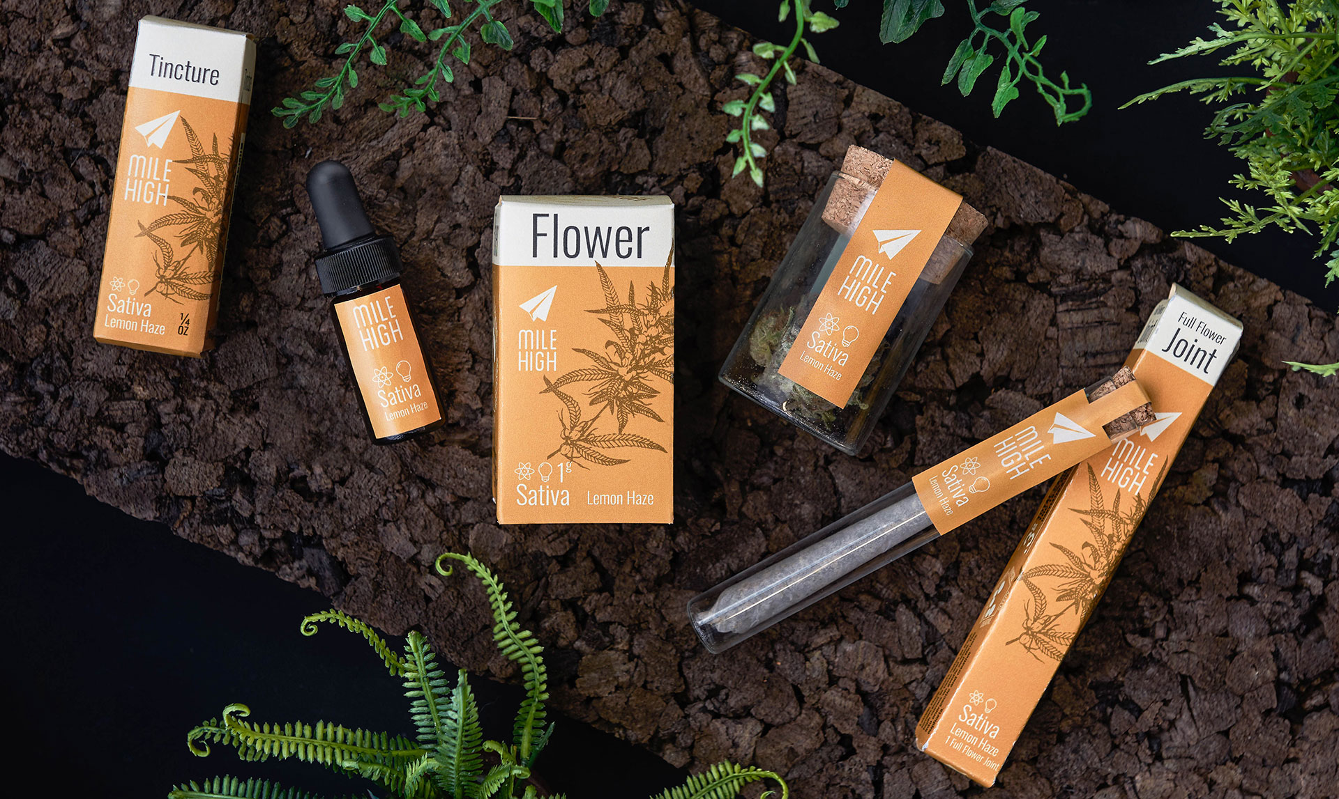
A key component of Mile High's strategy is app based ordering. From the app, you are able to order marijuana flower, joints, cigs, edibles, tinctures, and vape oil and select a local pot shop as a pickup location. Mile High also offers various personalized and theme boxes to make the experience even easier for members just learning about recreational marijuana.
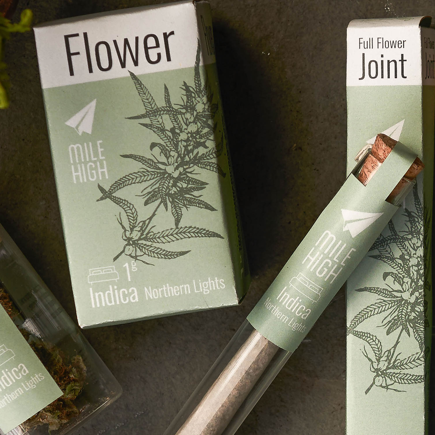
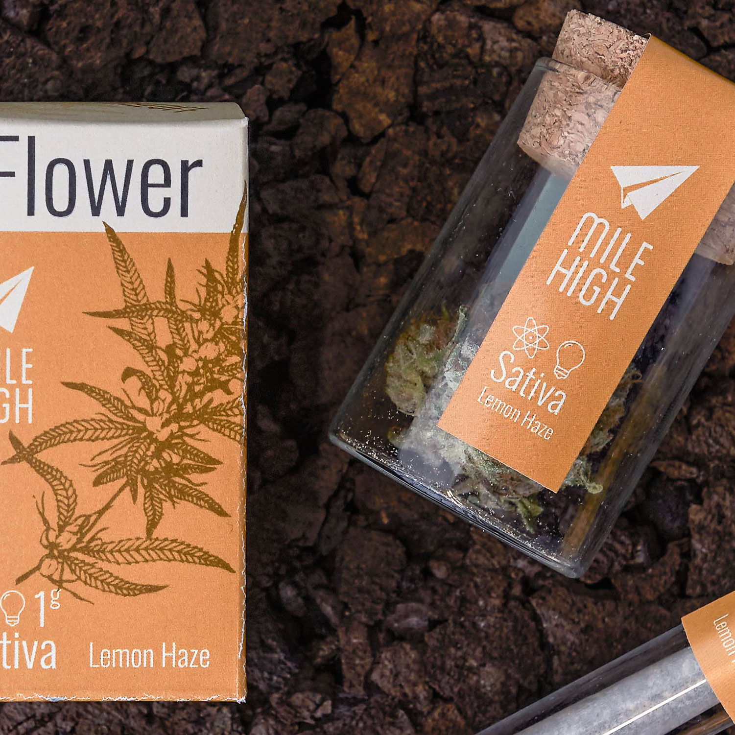
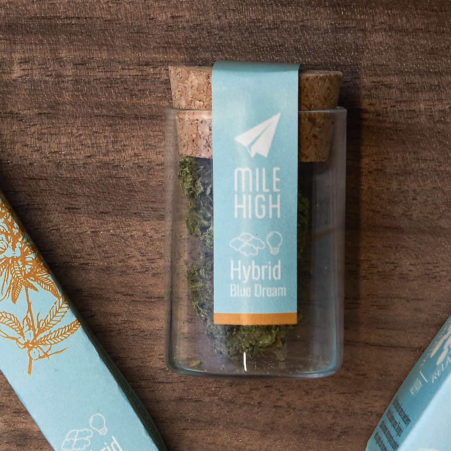
For packaging, we wanted each variety to have a unique identity. By color coding with either gold, green, or a combination of both, Mile High members are able to quickly identify which high best fits their mood. With illustrations and easy to understand iconography, our packaging rethinks the current marijuana marketplace's tendency to have a one-size-fits-all packaging model with strains only identified by unsightly testing labels.
Mile High started as a quick assignment to solve the logistics and user experience of delivering cannabis products by drone. The final product was a presentation and a video. During the research and planning process Tom and I were fascinated with the possibilities and the complexities of working on a project for this quickly changing field and were inspired to take it further.